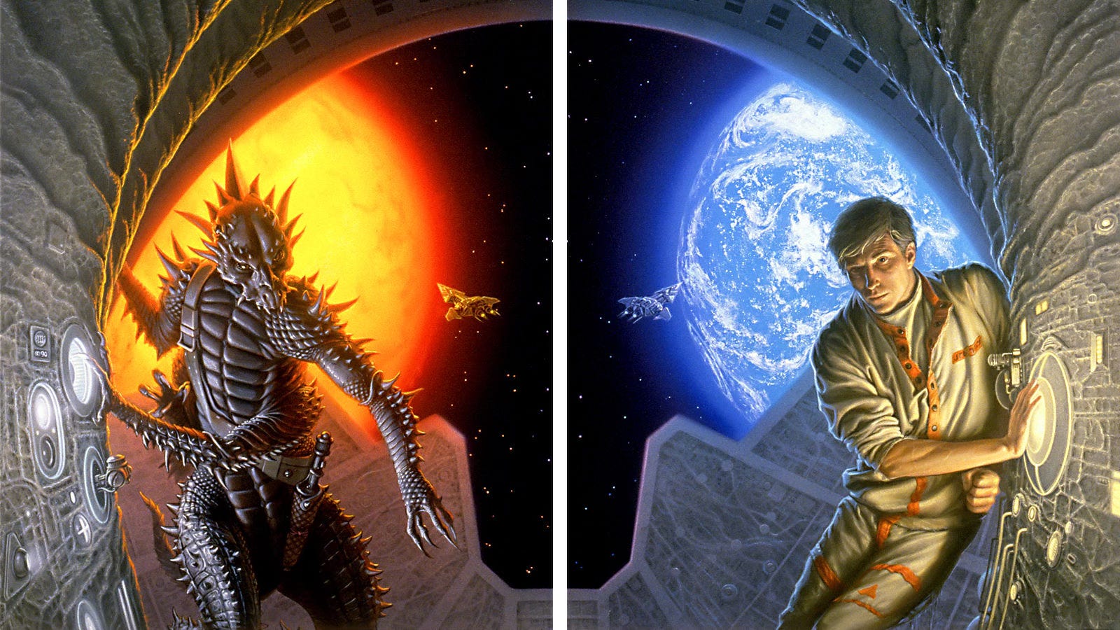
Back in 1990, DAW offered two cover variations of The Madness Season—a terrific SF novel by C.S. Friedman.
As a bookseller, I remember unpacking both covers and quickly deciding to display them side-by-side to complete the image. The cover art made it an easy sell, and at the time I thought it was a clever way for the publisher to gain an extra stripe at the cash wrap.
A few years later in the pages of The Art of Michael Whelan, I thought it was interesting that the artist was pondering which variation sold more. As an illustrator, of course, Michael had a real stake in determining which version was more marketable, but how could he not know?
To this day, fans are still curious but Michael still can’t answer what has become a common question whenever I post the art.
Based on my real world experience, I think the alien sold faster in my store but I’m not positive. That’s why 35 years later, I found myself asking Betsy Wollheim, long-time publisher of DAW Books, which cover won out—the man or the alien?
“Unfortunately I can't answer your question since books with mixed covers were shipped in the same box,” Betsy replied. “We've been wondering for years, ourselves!
“When we most recently reprinted it,” she offered, “I believe our designer used the human cover, but the alien cover shows up on Amazon.
“So the mystery remains unsolved!”
Maybe not…we’ve got a healthy audience with tens of thousands of readers who I hope might be willing to help solve this one, so I figured why not kick off the June Q&A with a reader poll!
-Michael Everett
Jace Maybrier on Cara asked:
How often do you find yourself wanting to revisit The Dark Tower in terms of creating more art for it?
MRW: Oh, there are so many things I’m interested in or have a connection to, that it’s a totally random thing. I can only say, “Every once in a awhile”— 😉
It’s usually based on some off chance thing that happens in my life, like seeing a tree branch that looks like a nine, and thinking, “That would make for a cool Gunslinger background” or whatever.
In this case, it was just a smear of paint that looked to me like a campfire, and I happened to have some Burnt Umber on a brush, so I sketched in Roland and liked what I saw, and one thing lead to another.
I know that sounds unintentional and accidental, but hey, that’s life! It really goes that way. If you read about how Stephen King thought up the basis for his story “The Mist,” it is almost the same exact process. Accidental random imagination—it’s where the most fun is in art!

Brian Box Brown on Bluesky Social asked:
How long before the publication of the book did you get to read it [The Dark Tower] or did they just give you descriptions to work with?
MRW: Ahh, one of the perks of illustrating is getting to read novels before the rest of the public does. And so it proved to be on The Dark Tower, much to my delight and wonder.
It had to be available for me to read since I was asked to do several interior illustrations for the book, and I couldn’t have done them without knowing the whole story.
The first painting I completed was THE END OF THE ROAD, which I finished in 2003. The book was released in September 2004, so it was about a year lead time. SHOWDOWN AT END WORLD was done before I learned that the cover would be a wraparound.

Strani Zavoare on Cara asked:
Is the canvas texture actually the canvas itself? It looks like it runs at different angles. Either way it's an ingenious way to convey the idea of weird angles in the rock! It makes you feel like something is off but without being able to say exactly what.

MRW: On this particular piece the gesso coating was rather thickly applied, so it covered up much of the canvas texture.
Still, I wanted to make use of the remaining texture to create the illusion of a rocky surface on the mountains. To do so, I applied the base tone [mostly a Payne’s Gray with a touch of Raw Umber] using a cardboard “squeegee” that I made for the purpose. By dragging the piece of cardboard around at various angles it exaggerated what canvas texture there was, creating the sort of “accidental” effects I was hoping for.
The cubic structures were added afterwards, mostly by using a small brush with a squared-off end, which facilitated the sort of shapes I was looking to create.
Maxwell on Bluesky Social asked:
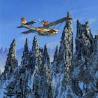
This rocks, I love seaplanes a lot as well as this story. It’s a Dornier J Wal with skis installed, right?

MRW: Yes, that’s the plane! HPL mentions that the Miskatonic expedition was using specially modified Dorniers, so I took that to mean that they were equipped with skis.
The D J Wal was a very distinctive plane, looking rather odd to our eyes nowadays but it garnered a respectable reputation in its time. Roald Admunsen used them on one of his aerial polar expeditions.
Esteban Sanchez on Bluesky Social asked:
Hi Michael! If you've got the time, I'd love to hear about how you went about painting the stonework at the bottom of the image! Was there a maquette involved, what was the reference like, etc. Absolutely stunning!
MRW: I had some pictures of southeast asian carvings of demons to inspire me. I can’t remember where I saw them—maybe National Geographic?
I drew my versions on a tracing paper overlay and transferred them to the painting surface, which was canvas. I refined the outlines / contours in charcoal pencil, then used fixative to set the drawings so they wouldn’t smear when painted over.
Part of the reason I used canvas for this painting is that I wanted a gritty stone texture to the idol faces. And I knew that by employing some dark and dirty washes over the canvas texture it could facilitate that effect.
Once I’d established a basic tonality to that area I set about adding the darks and lights to the shapes. The shadow areas are made with glazes and the light areas were refined with lighter opaque tones. It took many washes of different greens and browns to get the right feeling to the stone, but the canvas texture was a big help.
doktor ross sewage on Bluesky Social shared:
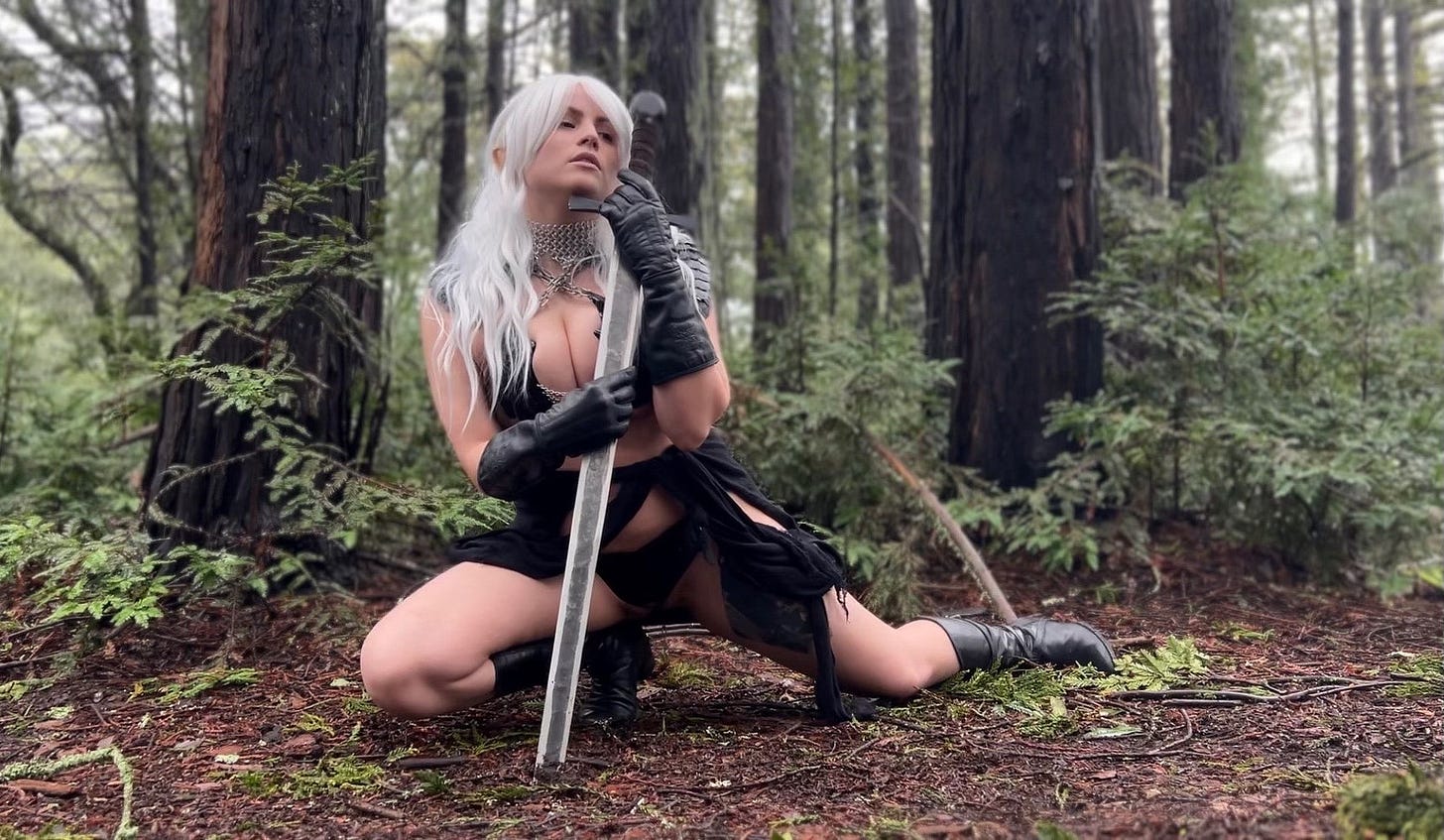
Love this rendition of Elric… we have a print hanging in our living room and we did a photoshoot with my gf recreating it in the Oakland Hills 💜
MRW: That’s fun! It’s like my STORMBRINGER story in reverse.
When I was beginning to work on that cover, I was searching for a pose I thought would work for the painting by taking a pole and swinging it at tall weeds in the backyard.
When I held the pole up over my head, I could feel how the pose would look. So, though I wasn’t in costume I was acting the Elric part too.
Weekly Art Recap
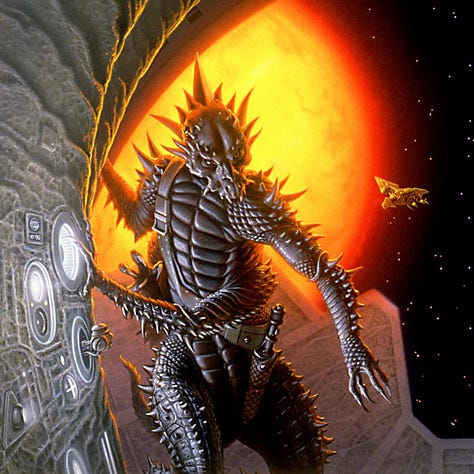

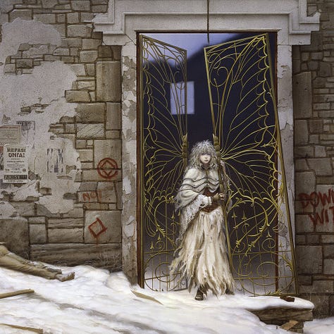

Daetrin - cover illustration for The Madness Season by C.S. Friedman
The Scale of Eternity - examining our drive to quantify all of human experience
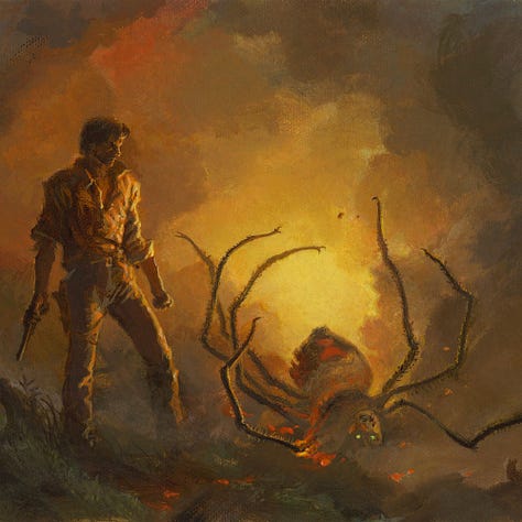
It Writhed in the Embers - beware spiders…err, spoilers…from The Dark Tower by Stephen King
The Fourth Crusade - a chance to reread the lessons of history
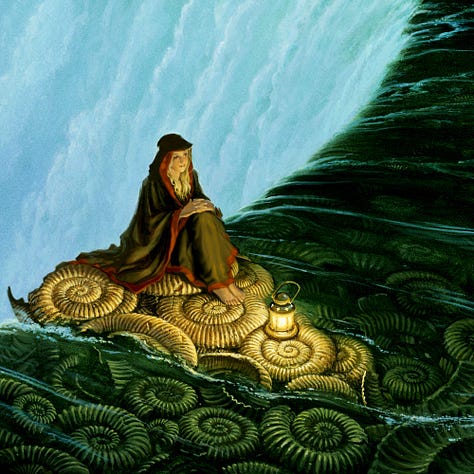
Eliste - cover illustration for the incredible novel Illusion by Paula Volsky
Leapin’ Lizard - fun with color and motion with a Palette Gremlins from 2022
Coming Soon…
Join us for another Whelan Wednesday as we reveal a new original painting. Stay tuned for the full tease coming soon.
An exclusive preview of the original art for this week will be available to our paid subscribers on Substack before the art is released in our shop on Wednesday, June 25 at 11am ET.
Subscribe so you don’t miss a thing…
If you like in-depth content about Michael Whelan’s art, please consider subscribing. Our weekly newsletters are free, and we offer additional perks for paid supporters like an exclusive digital wallpaper of DAETRIN coming this week!




Those are fantastic. I really enjoy seeing the "before and after" paintings.