Editor’s Note: The Donning Company published Michael Whelan’s first art collection in 1979 under the Starblaze imprint. Both Wonderworks and the artist were nominated for Hugo awards that year.
In 1980, Michael won the Hugo for Best Artist for the first time. He would earn that prestigious honor for the next 7 years consecutively—13 times overall—establishing himself as the most decorated artist in the genres of science fiction and fantasy.
The following are his thoughts on illustration as presented in the foreword to that first book.
Foreword
A good artist is a good communicator. The art form may be written, oral, visual or a host of others, but the resulting creation must convey something to its audience. Therefore, the artist has to skillfully combine craftsmanship and approach so that an idea or feeling is clearly communicated to a significant number of people.
In the field of illustration, this concept is complicated further by the illustrator’s task of re-expressing the ideas of another artist: the author. Ultimately, not only must the artist communicate the thrust of someone else's ideas to a significant number of people, he also must do this in a manner consistent with the author’s vision, while doing his best not to miscommunicate his own. Add to this the necessary element of commercialism and the illustrator's major dilemmas become apparent.
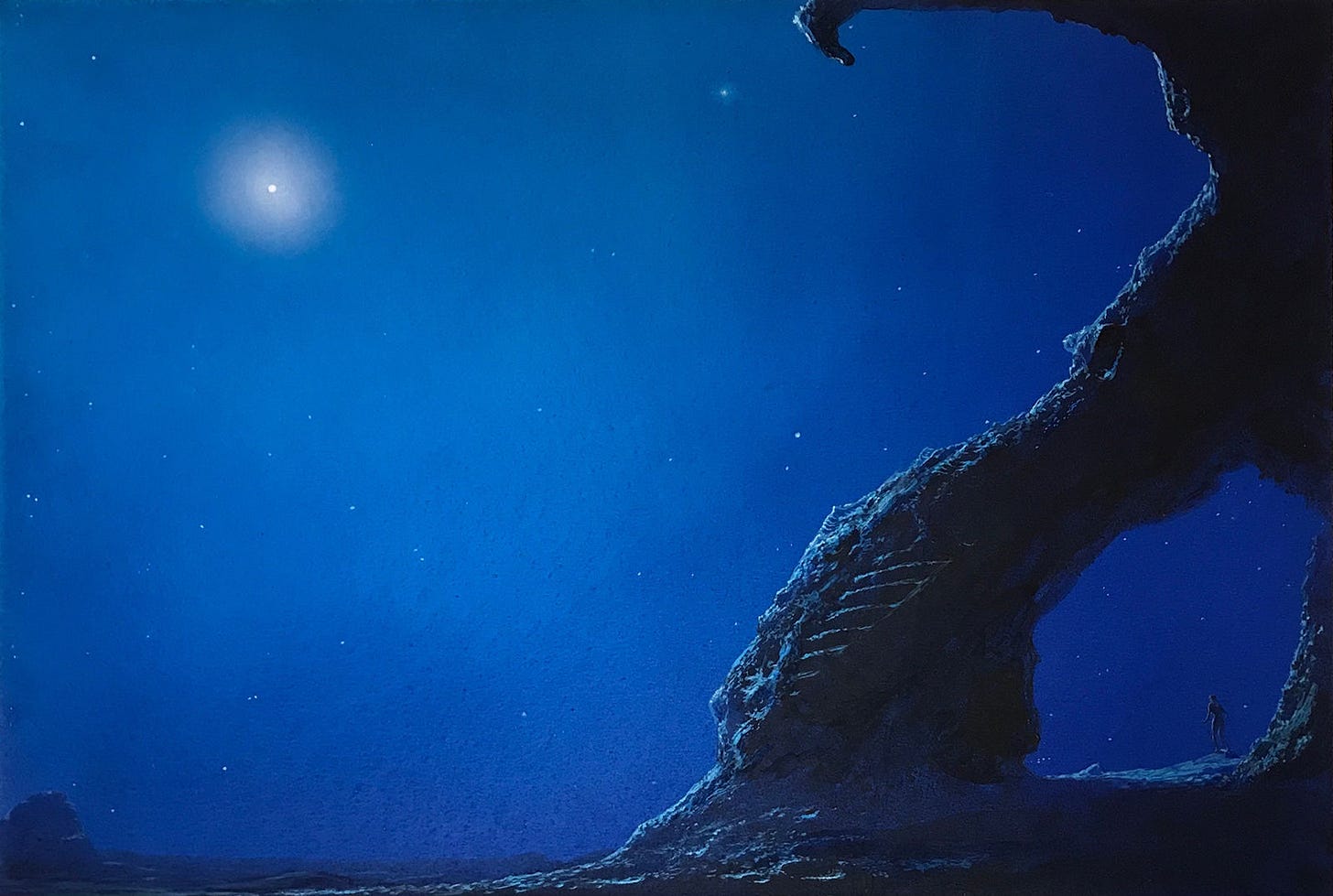
Successful communication in the field of editorial illustration involves two important considerations. First, like every good artist, the successful illustrator is a simplifier. His foremost talent is the ability to select and then to emphasize, subdue, or to omit given information in such a way that the message comes through. In other words, the fine editorial illustrator has a commitment to transcribe faithfully in visual form the most important aspects of a story. The task is made especially difficult by the demands of the field, because the second consideration facing the illustrator is that the image he creates must be sales-worthy.
Often, the illustration has to survive poor color reproduction, clashing mammoth type, indiscriminate cropping, and generally unimaginative graphic design. In the special area of paperback book cover art (which represents the majority of my work to date) there are even more frustrating restrictions. For example, how can each cover illustration be unique and striking when the top third must be left “open” for title type and the whole image reduced to a mere four by seven inches?
The artist must walk a fine line between commercial necessity and aesthetic responsibility. One wonders why such artwork should be bothered with at all! But for me, there’s the irresistible challenge of creating a vital and expressive piece of art out of the inherent difficulties in commercial illustration.
And then there are the stories.
I find a special attraction in fantasy and science fiction illustration in the written material itself. There is a seemingly infinite variety of writing in this field, and it calls for the greatest use of my imaginative and creative abilities. In doing fantasy and science fiction illustration, I can be absolutely faithful to a writer’s story and still paint a picture that echoes fantasies I’ve nurtured since my first flight to Mars—aboard the spaceship I drew on the underside of my parents’ coffee table when I was 4 years old.

So, many of my own ideas and feelings go into my work. But because I strive to fulfill my obligation as an illustrator—to express narrative, characters, themes, or moods as the authors describe them—my paintings reflect a part of the author as well. Hence, the design of the book you are now holding.
I’ve invited several authors for whose books I’ve done cover art to share their thoughts about the importance of good illustration. Together, my artwork and comments along with the authors’ views tell much about the field of science fiction and fantasy literature and its “packaging.”
Here is Wonderworks—a look at the first years of my career as an editorial illustrator, but more importantly a communication of my own sense of wonder and my wish to inspire yours.
Michael Whelan
Brookfield, Connecticut
Fall 1978
Remastering the Past
More than a decade ago I started archiving Michael’s art books for digital reference. The PDFs I assembled have served as intended for years, allowing me to quickly search for what I need to curate daily art posts, but as you would expect these files were meant to be practical not pretty.
I had a notion that this project would eventually lead me to produce e-books to fill the gap left by long out-of-print editions of Wonderworks (Donning 1979), Michael Whelan’s Works of Wonder (Del Rey 1987), and The Art of Michael Whelan (Bantam 1993). The question has always been whether fans would want such a thing.
To make electronic editions viable, I knew I would need to do more than replicate the print editions. I spent quite a bit of time wrapping my head around where the books could be improved, and I kept coming back to paintings that fell between the cracks. It’s surprising how many great illustrations still have not been featured in an art book because of timing and circumstances—I can name quite a few!
A lot of that has to do with Works of Wonder being published by Del Rey. Michael’s second art collection featured covers only for that one publisher. Many illustrations completed for other publishers from 1979 to 1987 would be featured later in The Art of Michael Whelan…but not all.
When we eventually follow-up to with another coffee table book, we’ll have an eye towards filling in the rest. For now, there is an opportunity to do that with remastered digital editions.
With that in mind, I pushed past the publication date of Wonderworks (1979) so that I could include paintings that made sense even if they came out later. That would mean expanding representation of authors like Poul Anderson, C.J. Cherryh, and H. Beam Piper. A bit of a no-brainer there, right?
The original print edition of Wonderworks runs 120 pages. The e-book now stretches to the equivalent of 220 pages. It’s not quite done as I still have text to assemble, and that’s going to take some coaxing “behind-the-scenes” information from Michael.
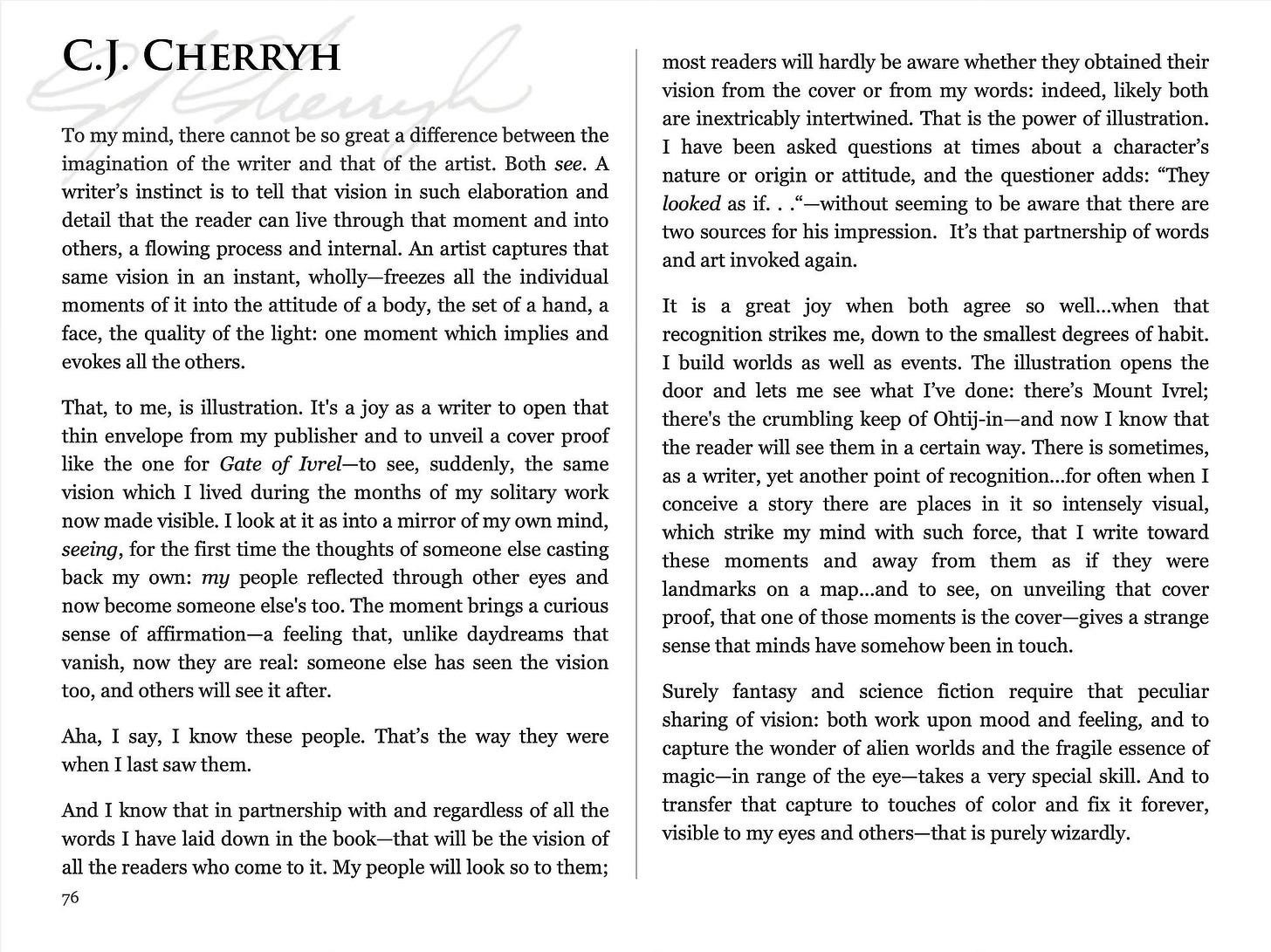
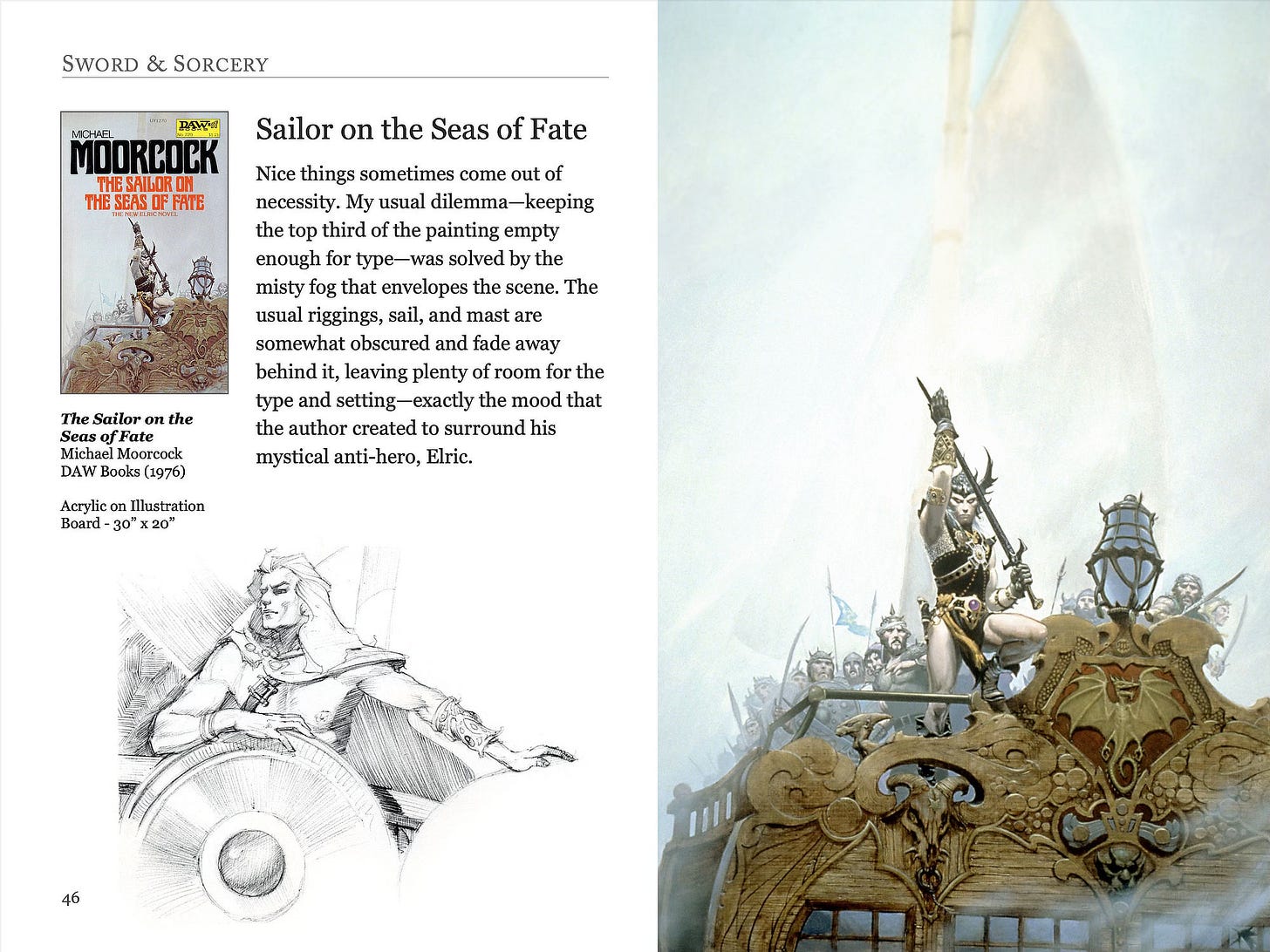
In the meantime, I thought I’d show off some of the design changes. (Make sure to click the images to see the page layouts in all their high res glory!)
Michael created unique art for each chapter of the print edition. Most of that art was sold before he had a chance to photograph it, so there is no archival record. Unfortunately that left me to work from 70s quality print—not ideal but with a little photo editing magic I was determined to make it work.
To improve the reader experience, I separated text from the chapter art. The goal was to give the art breathing room to appreciate it in full and to give the reader a break from eye strain.
As you can see below, the format change allowed me to include additional art where space permitted.
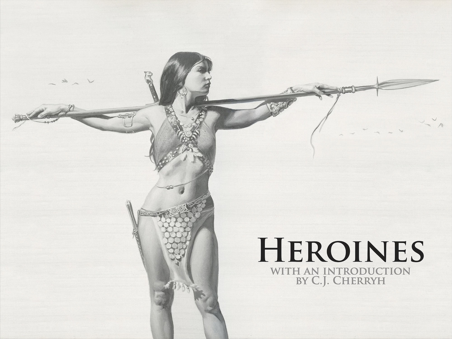
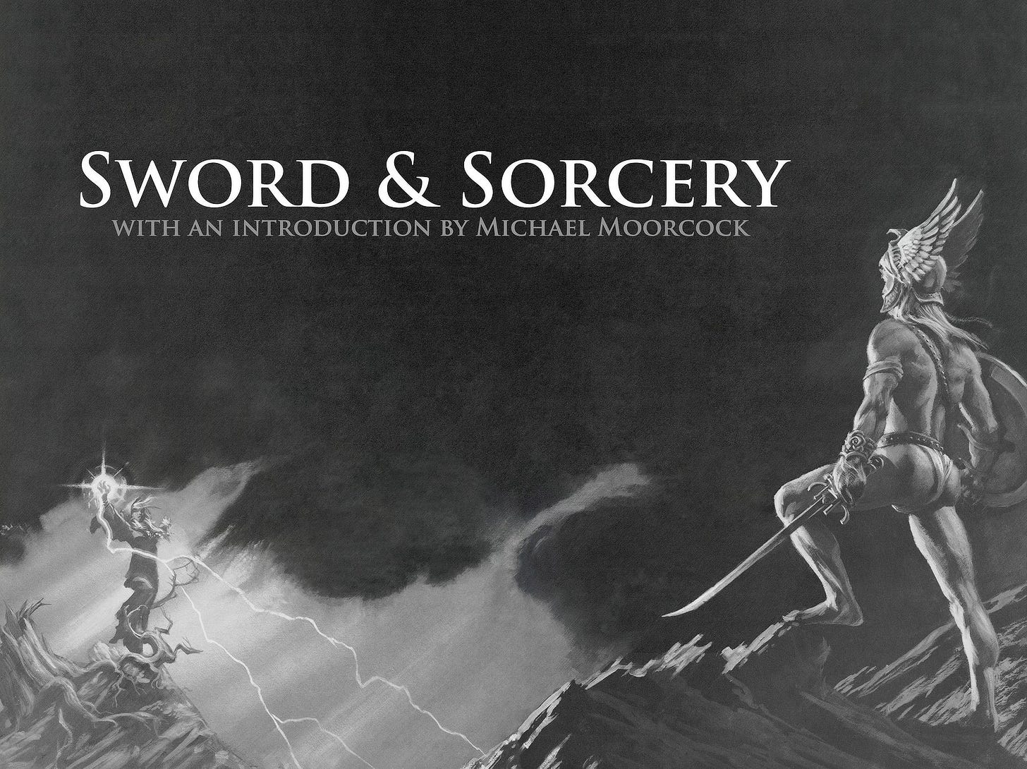
There are a total of six sections in Wonderworks:
Science Fiction with an introduction by Poul Anderson
Sword & Sorcery with an introduction by Michael Moorcock
Romantic Fantasy with an introduction by Anne McCaffrey
Horror with an introduction by Gerald W. Page
Heroines with an introduction by C.J. Cherryh
Aliens with an introduction by Alan Dean Foster
Paid subscribers will be receiving an expanded preview that will include all of these sections—expect that in a separate email soon—and ultimately the entire book when it’s complete. We’ll also be making the e-book of Wonderworks available in the shop.
What do you think? Does this look like a worthwhile update for an old classic?
Weekly Art Recap
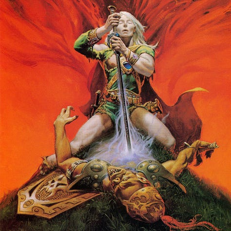
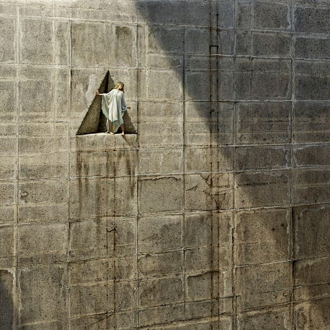
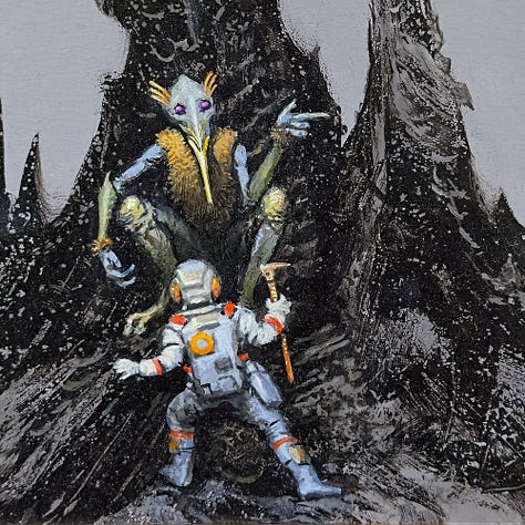

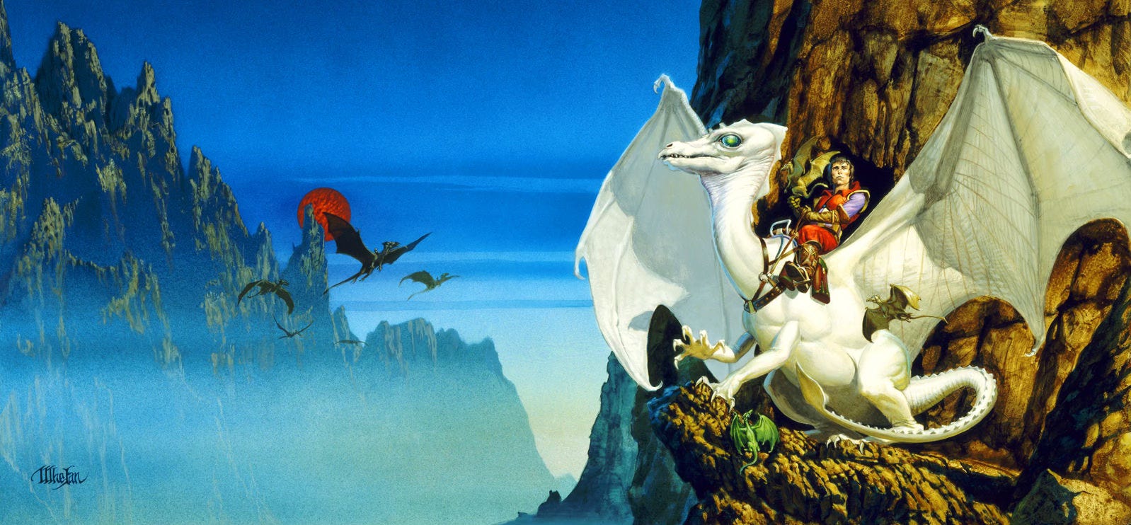
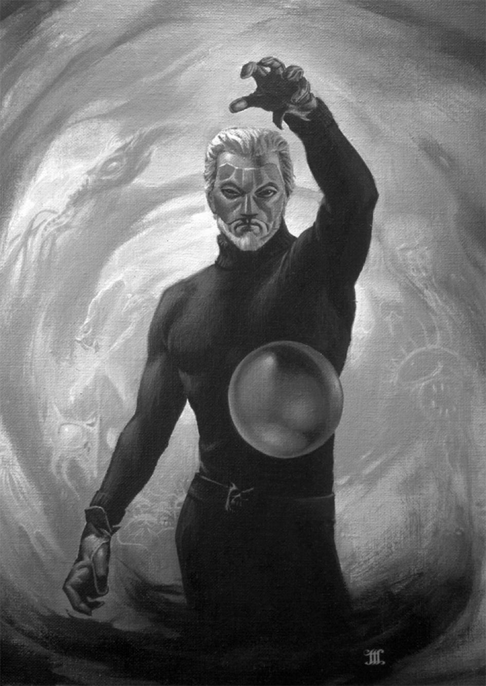
White Wolf - cover illustration for Weird of the White Wolf by Michael Moorcock
Chasm - a fan favorite from the Faded Star series
Turn Left at Tethys - the 2nd Leftover & Palette Gremlin for 2024
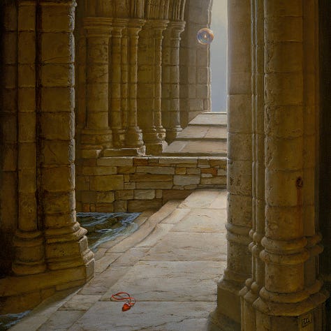
Sanctuary - both a Passage and Portals painting
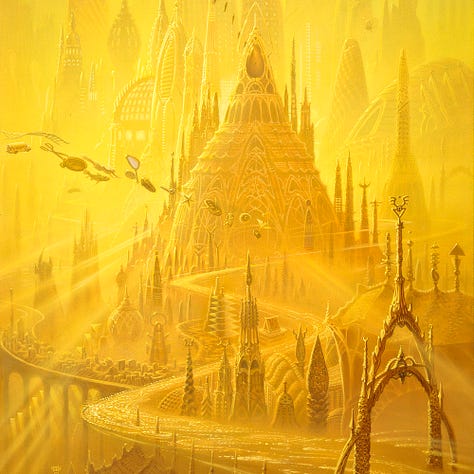
City of Golden Shadows - cover for the Otherland book by Tad Williams
Afternoon Shadows - with a special dedication to Audrey’s mother Pat Larsen who passed away on Tuesday at the age of 103.
Question and Answer with Michael
Given the events of this week, we’re going to postpone the Q&A and pick it up in a later newsletter. If you have questions for Michael, please continue to send those in via comment or email reply.







Ah, but you are not updating an old classic, you are creating a new one! Fantastic! I envy your task as a fan, and wish you luck as an editor. Daunting, yet a dream come true.
It's beautiful!