Like most readers, I have opinions about SFF cover art that I’m not shy about sharing. The blame, of course, lies with Michael Whelan, who in his 50 years of illustration has spoiled me—and I assume every other reader who has stumbled across his work.
While working on the digital edition of Wonderworks, I posed a question about a Poul Anderson cover that has been bothering me for years. It amounts to “Monday morning quarterbacking” the decision of which concept to develop for the cover.
Before I get to my question, let me put you in the art director’s chair.
The Cover and What Could Have Been
ME: There’s one concept that stood out to me for The Demon of Scattery—one of my all-time favorite prelims—and I’ve always been curious how the AD passed on choosing it because the composition is so dynamic. It would have been a slam dunk of a cover.
MRW: I couldn’t agree more!
Back then I felt that it was on me to offer comps that would generate a good cover for a book, and if any of them didn’t make for a good painting that was my fault for not realizing the full potential of the original concept.
In retrospect, I often find myself asking a variation of the same question you posed: “Why on Earth did I submit any other options when THIS concept is so obviously the best of the bunch?”
The answer, of course, is that it wasn’t obvious to me at the time.
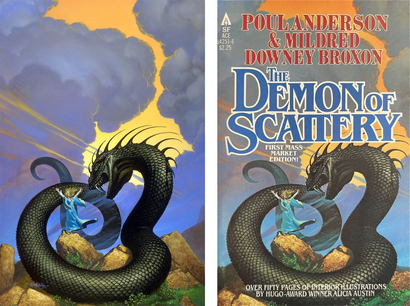
Also, as a cover artist I felt it incumbent on me to present a range of options, attempting to reflect what the publisher [and occasionally, even the author 😉] wanted emphasized in the image. The editors called the shots more often than not, and being human, they often made regrettable decisions.
And on more occasions than I would like, the people who really called the shots were marketing idiots who thought THEY knew better than anyone else what the public would be looking for. Most of the banal or downright crappy covers one sees are the result of that aspect of the corporate bookselling machine.
There Can Only Be One…No, Not That One!
While a few of the concepts submitted were strong, my favorite is pictured above—and not simply because it was the most polished of the lot. The composition is sinuous and alive with action.
There are so many subtle points of connection that bring eyes where they need to be. Placed off-center right, the warrior provides an easy entry point with the lines of his body directing attention to the serpent and the sorceress. The curve of the rocks forms a bowl, a solid foundation to leap into the image.
The serpent coil framing the warrior implies threat, drawing focus as we vicariously stare over his shoulder into the open maw of the serpent. The use of yellow leading to the head is subtle and effective with the stripes increasing in weight as we get to an intense splash of color in its eyes. The red mixed into the shadow of the brow ridge hits like an explanation point. Every bit of this is kinetic, aiming the serpent at our hero like an arrow of malice.
But what truly takes this concept over the top is the ambiguity. The pose of the sorceress connects man and snake with the sweep of her arms. Her traffic direction is compositional, of course, but her pose with skirt swaying also signals pause. Did she summon the creature? Are her arms thrown out in caution? Is the warrior about to spring forward or does the threat of the serpent check his courage as they lock eyes?
As a potential reader, I’m captivated as all of these elements come together—and that is exactly what a great cover illustration is supposed to do. Drawn into such an evocative scene, how could I not pick up the book?
So did you agree with the art director and opt for the boldest color? Or did you prefer the energy of another concept? Let us know which you would have chosen and why.
Live on NPR CT Tomorrow at 9am ET
In advance of Tolkien Reading Day this week, Michael Whelan and David Wenzel will be joining host Catherine Shen to talk all things Tolkien on WNPR’s Where We Live.
The show airs live on Monday March 24 at 9am ET and should be available later as a podcast in case you miss it.
Weekly Art Recap



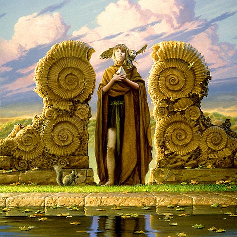
The Integral Trees - cover for Grand Master Larry Niven
Sunflower - inspired by the concrete sanctuaries of Michael’s youth
Paradise - a Kenyan inspired alien landscape for Mike Resnick
Prudence - first take (of many) on the classical Greek virtue
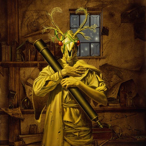
Buffo - cover for The Floating Gods by M. John Harrison
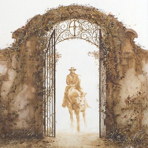
The Gate of Eluria - interior for The Little Sisters of Eluria by Stephen King
Subscribe so you don’t miss a thing…
If you like in-depth content about Michael Whelan’s art, please consider subscribing. Our weekly newsletters are free, and we offer additional perks like original art previews for paid supporters, including upcoming listings for Wind and Truth and At the Mountains of Madness.


I picked 2, not knowing anything about the content, because it was ambiguous; it was either the sorceress against the snake, or it was the sorceress controlling the snake. Question covers are good covers. 3 is the best composition, but it is the only one that features the barbarian, and it foregrounds the barbarian completely. If the sorceress is the main character (as implied by the other three not including any other character), then focusing on the barbarian is inappropriate. If I knew the content of the book, I might have made a different decision.
I would also make a terrible art director, because I don't know art theory, and can't judge on technical merit.
As a woman I would never pick up a book with a cover that puts some warrior’s butt as the focal point. I picked #1 with #2 as a close second choice.