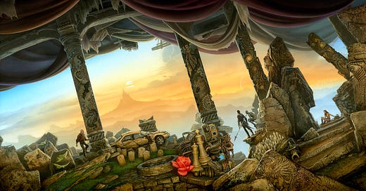
The Collected Stories of Roger Zelazny
The making of Z-World plus an exclusive wallpaper download

I rank Roger Zelazny as one of the best F/SF writers of his generation. One of my prime regrets is that I never got to meet him.
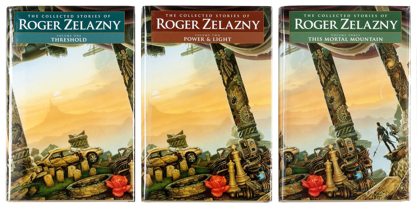
I was immediately intrigued when offered the chance to provide covers for a multi-volume collection of his works by NESFA Press, the publishing side of the New England Science Fiction Association.
While pitching the project, the publisher explained that Roger had said in an interview that he always wished to have me do a cover for one of his books; alas that it didn’t come to pass during his lifetime. But I was happy to show my respect for his legacy through my art.
As with any illustration, the first step was reading. Lord of Light had been a favorite of mine since I first read it in college, so that’s where I chose to begin my immersion in Roger's universes.
David Grubbs, the editor on the project, provided me with all the stories included in the collection. Some I had read previously, but quite a few were new to me. I became increasingly aware as I read how vast and all-encompassing Roger's writing was.
Initially I felt overwhelmed; there was simply too much to try to do a fair job of capturing it all. David sent a list of elements summarizing themes and motifs in Roger’s writings for me to consider, and that was quite helpful.
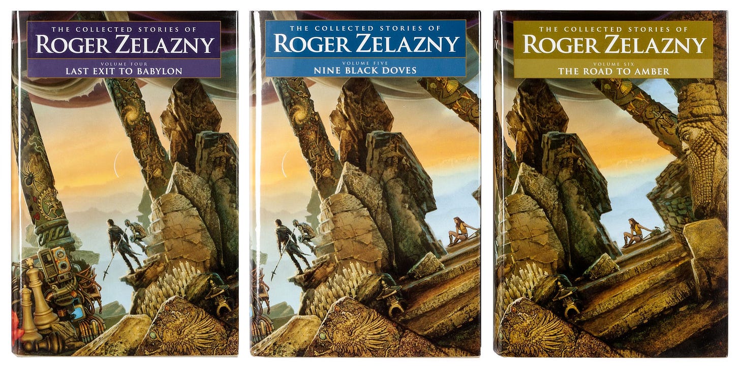
Upon reflection I settled on a blend of 1) managing elements of RZ stories that applied to tales within a particular volume, and 2) adding things ‘on the fly’ as a part of the process of doing the painting, using connections that popped up while adding details to the composition.
I’m not going to lie…it did occur to me that I could paint anything at random, knowing that a connection could be found between what I chose to depict and some narrative or thematic element in Zelazny's writing.
That was liberating. I felt free to develop the composition from a “big design” standpoint since there was such a wealth of material to draw on to “populate” the image areas.
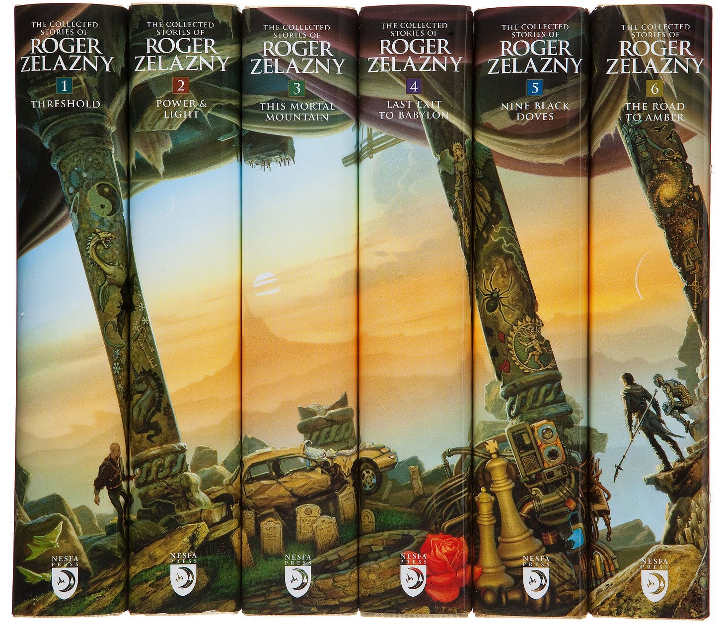
The idea of running one image across the spines of the seven books was discussed early on; I believe Alice Lewis, jacket designer on this project, was the one who originally mentioned it. The challenge of making it work seemed exciting, so I was drawn to that approach right away.
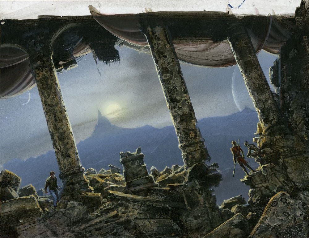
Once the reading was complete, I began to experiment with different conceptual frameworks to place the elements within, working very loosely on small panels in monochrome acrylic paints.
Right away I decided that the composition would best be done on a diagonal to negate the forced verticality of the edges of the volumes. A series of angled columns would cut across those verticals and carry the main design from one spine to the next.
I liked that the columns suggested old classical cultures in desolation. I can't explain why it seemed fitting to me.
Once the framework was established, I was ready to work with and around those shapes. I made a compositional sketch with the edges of the different volumes marked off, trying my best to arrange the salient elements to function both on the spines and in the image as a whole.
I felt the columns alone would be too linear, so I added the curving shapes of the fabrics on top to provide a contrast for the type destined to go there as well as to give relief from the linear repetition of the columns.
Some columns are intact, but others have broken. An interrupted pattern, I thought, is more interesting than rigid regularity and conformity.
I usually work from background to foreground, and this painting was no exception. In spite of my best efforts to be methodical in my approach, there is always back-and-forth when I adjust the relative contrast between the foreground and background. It usually involves some see-sawing until the balance feels right.
I’ll admit that I was too impatient to get going on the image to wait and have all the various elements ironed out in advance. Once I had the essential foreground/background areas defined, I went to work, trusting myself to find the shapes within the image as I worked on it.
I was aiming more for a feel of the essence of Roger's stories rather than slavishly shoehorning a set number of pictorial pieces into the final painting.
Michael Whelan
Exclusive Wallpaper of Z-World
Paid supporters of our Substack can download high resolution wallpapers of Z-World. Read to the end of the newsletter for details on how to download.
Save on the print…$20 off thru Monday!
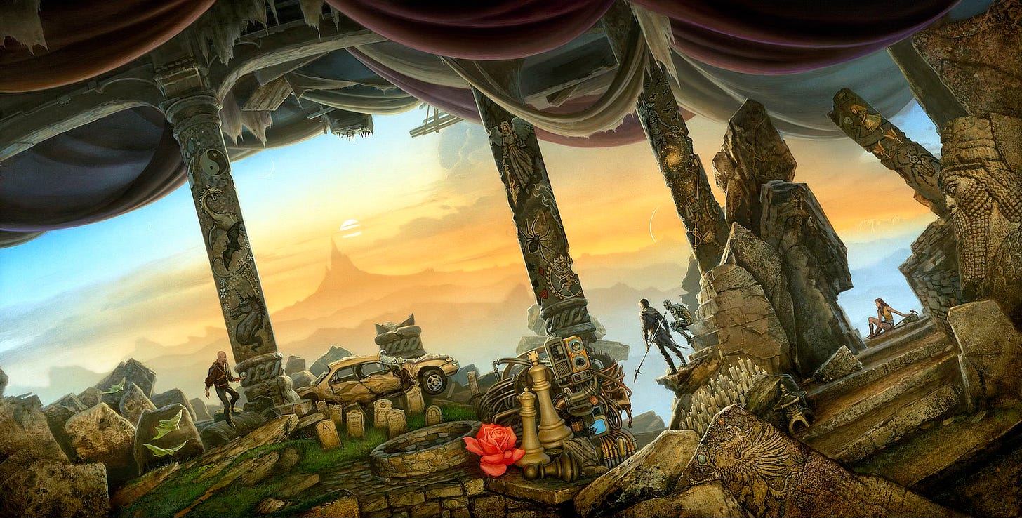
No coupon necessary. Price is valid until midnight eastern time on Monday 5/19/2025.
Weekly Art Recap
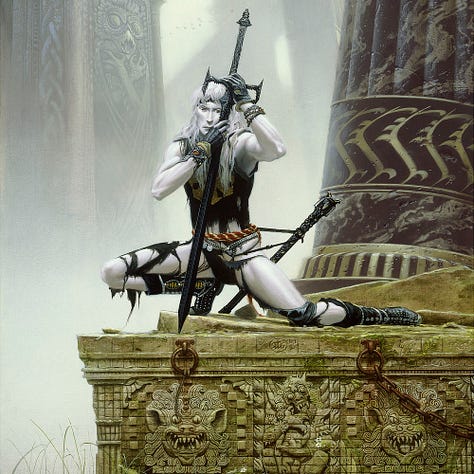
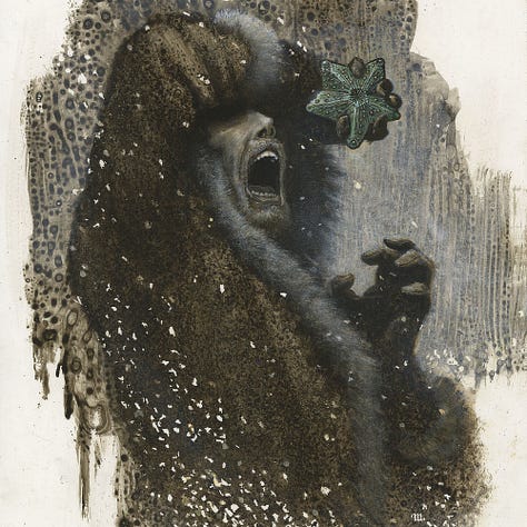
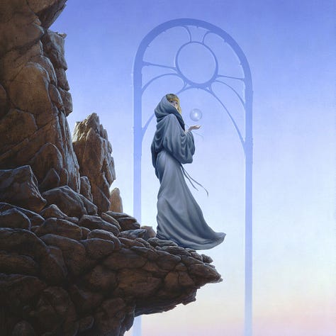
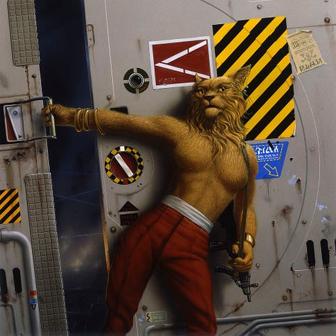
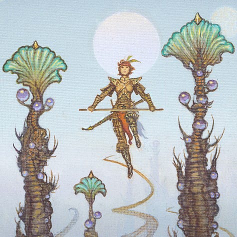
Elric and the Sinking City - cover for Elric at the End of Time by Grand Master Michael Moorcock
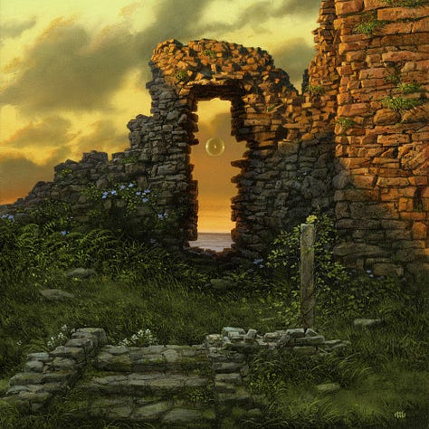
Doorway to the West - another search for light via the Portals series
At the Edge of Madness - interior illustration for a forthcoming publication of At the Mountains of Madness by H.P. Lovecraft
Verge - an early Passage work that later inspired Brandon Sanderson’s Elantris
Chanur’s Venture - a portrait of Pyanfar Chanur for Grand Master C.J. Cherryh
Warden of the Canyon - inspired by the stone pinnacles at Bryce Canyon
Whelan Wednesday Delayed
Thank you for the terrific support of our weekly original art listings this spring. We’re hitting pause on Whelan Wednesday for this week to allow our framer a chance to catch up.
We intend to return with another original on the Wednesday after Memorial Day, which falls on Wednesday May 28. Expect the usual listing time at 11am ET.
Subscribe so you don’t miss a thing…
If you like in-depth content about Michael Whelan’s art, please consider subscribing. Our weekly newsletters are free, and we offer additional perks for paid supporters like an exclusive digital wallpaper of Z-WORLD, which you’ll find a link to below the cut.


