Setting Type
Exploring book cover layout from the illustrator's perspective
One of the more frequent questions we receive on social media surrounds how Michael approaches cover type when he’s illustrating.
The general rule is that he sets aside the top third of the painting for the publisher to dress the cover however they see fit. While that’s a straightforward answer that fits most of these questions, I asked Michael to go a little more in-depth when Uli Kusterer on Mastodon asked:
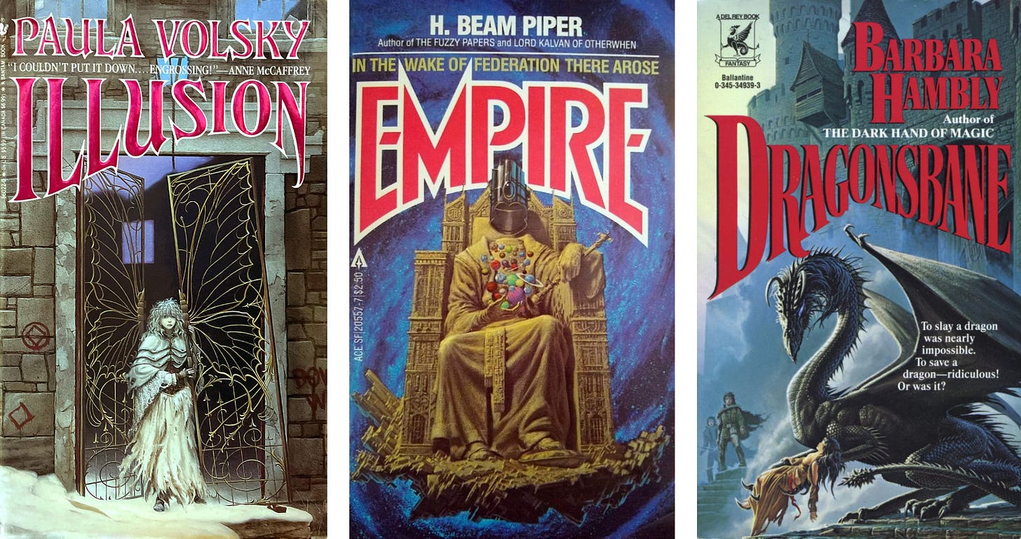
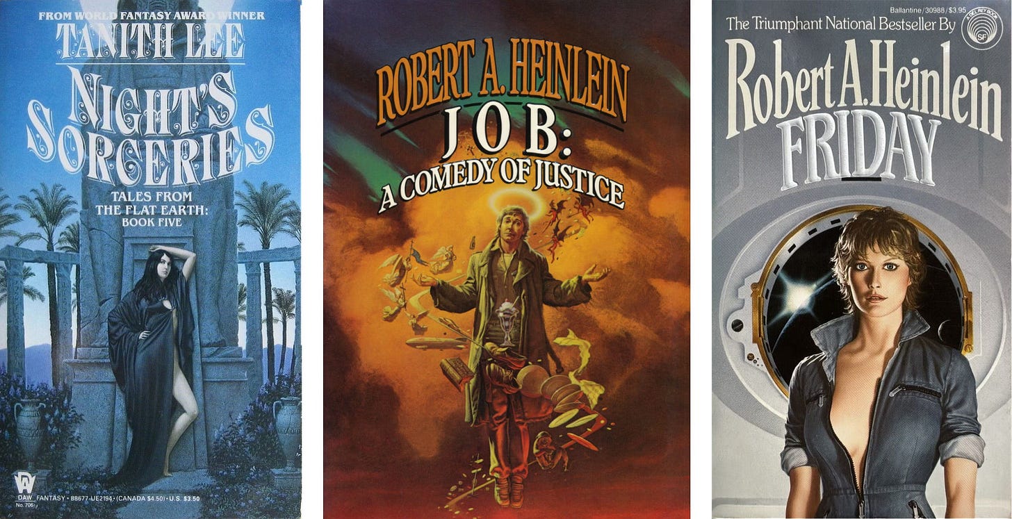
This seemed like a good opportunity to showcase different approaches to title and author layout that publishers have taken over the years. While top third layout is generally what we’ve seen, continuity of type even within a series isn’t always a given.
Let me know in the comments if you have a favorite cover design from Michael’s career. There’s a lot to choose from over 50 years!
Michael Everett
Top third and beyond
A book cover illustration assignment comes with the understanding that type will occupy a good portion of the cover real estate. Most of the time I’d compose things so the top third of the painting would not contrast too much with any type that would be placed there, but I didn’t worry too much about it. I’m usually content for the publishers to find the best solution that they can for the book and leave them to it.
There were many occasions when I was presented with a special assignment, where the publisher had an advance idea of what sort of type or graphic treatment would be used on the cover. In such cases we almost always would have a meeting beforehand to talk it over and decide what would work best for the layout of the cover.
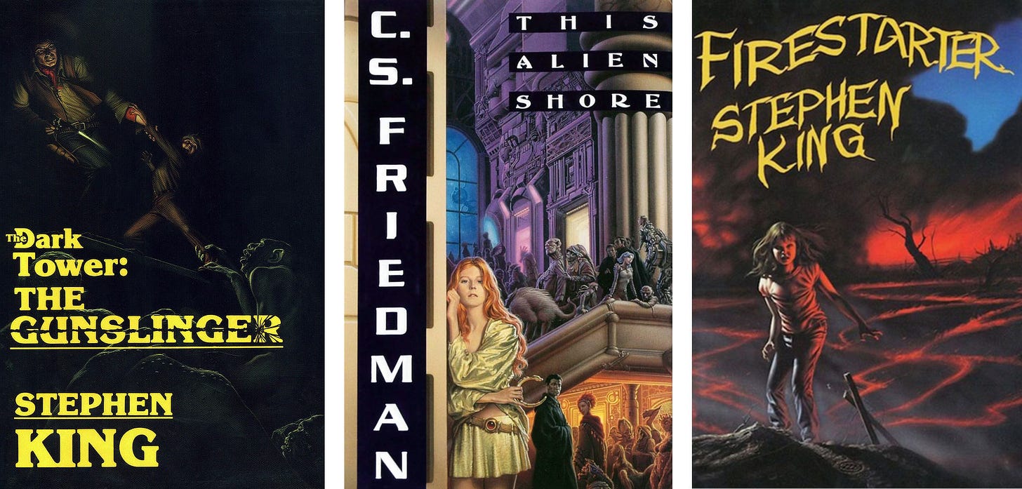
Sometimes that meant I’d know in advance exactly where the lettering would be, which was always a big help. Other times it was decided that the artwork would be placed in a box, so I'd be free to compose the picture without ANY concerns for type at all—which was ideal.
There have been a few times when I felt the type and other information cluttering up the cover was ridiculous, but I’ll pass over any specific names or titles and let the readers figure out for themselves which ones those were. After all, it’s pretty obvious.
One of the advantages to being in this field is that one has ample opportunities to display the unedited artwork to the fans at F/SF convention art shows and other venues, like the Society of Illustrators, art galleries or online. There everyone can see the work unadorned with type, blurbs, shopping codes and all the rest that gets put on a book cover, and that's fine by me.
Transitioning from illustration to personal work isn’t as difficult for me now as it used to be. The hardest part about illustration is recognizing and dealing with all the people you are expected to please: the editors, art director, marketing people, authors, and, of course the READERS.
And yourself!
Add to all those considerations the pressure of working under deadlines, and it can get to be rather nerve wracking.
To go from thinking that way to only having one person—myself—to satisfy can require some adjustment. It did for me back 25 years ago, I admit. It would take a week or two to change my head around. But nowadays I don’t sense any realignment in my thinking at all…but we’ll see.
I’m currently working to simplify my studio and my working space so that I can begin to tackle large scale projects again, and when I do, perhaps I’ll feel weird for a while. But I don’t think so.
I’ll let you know when it happens.
Michael Whelan
Weekly Art Recap
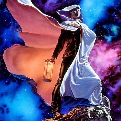
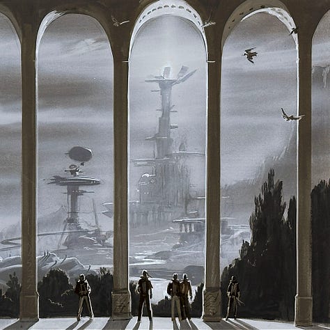
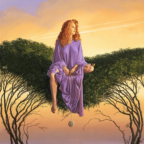
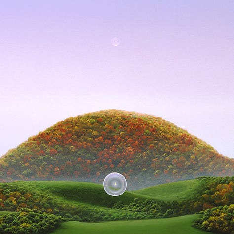

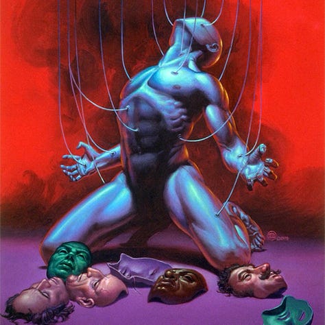
Chronos - the second cover for Incarnations of Immortality by Piers Anthony
Glimpse of Tomorrow - preliminary concept for the Victory album by the Jacksons
Perspicacity - from the Virtues, a quality of insight or knowing what’s going on
The Last Hill - painted for the title page of The Art of Michael Whelan
Lamarchos - the second Diadem cover for Jo Clayton
All My Sins Remembered - cover illustration for Grand Master Joe Haldeman
Creative Writing Contest
We are working through all of the writing contest entries and hope to have an announcement on the winner soon. Unfortunately we work at the speed of art around here (in case I haven’t mentioned that before).
Michael sent me a brief note as he was reading, saying that he “felt humbled by the quality and richness of the writing and honored that people felt so inspired by his little painting! “
We’re working on a little something to send to everyone who entered. We’ll need mailing addresses for that, so we’ll be reaching out soon for those. Or you can send the address with the name on your entry via email to webmaster@michaelwhelan.com, or simply message through Substack.
Pupdate
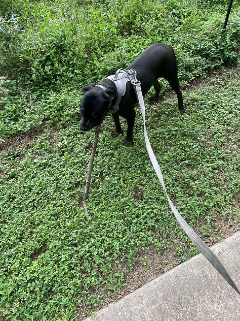
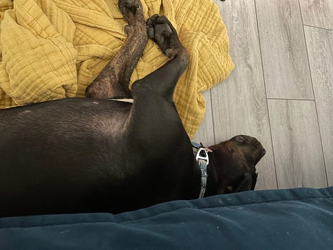
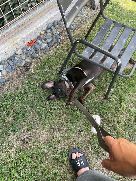
One of our subscribers asked for an update on Lola, the dog that adopted me a month ago. Lola is doing well. She’s 9 months old now and just had her follow up at the vet for her boosters. She’s gained a whopping 5 pounds (up to 46) in her time with me!
There’s a kids’ summer camp in the park and most of the counselors know Lola from the week she was living under the bridge after being abandoned, so she’s a bit of a celebrity in these parts. Every morning that we walk through the park, she gets lots of love. She’s a social girl for sure.
As you can see, Lola is still obsessed with sticks of large size. She’s a total goofball who runs herself—and her leash guy—ragged.
Coming Soon
Join us this week for another Whelan Wednesday as we feature the latest in Michael’s 2025 Leftovers & Palette Gremlins gallery project.
An exclusive preview of this small original work of science fiction will be available to our paid subscribers on Substack before the art is released in our shop on Wednesday, August 6 at 11am ET.
Subscribe so you don’t miss a thing…
If you like in-depth content about Michael Whelan’s art, please consider subscribing. Our weekly newsletters are free, and we offer additional perks for paid supporters like high resolution digital wallpapers!


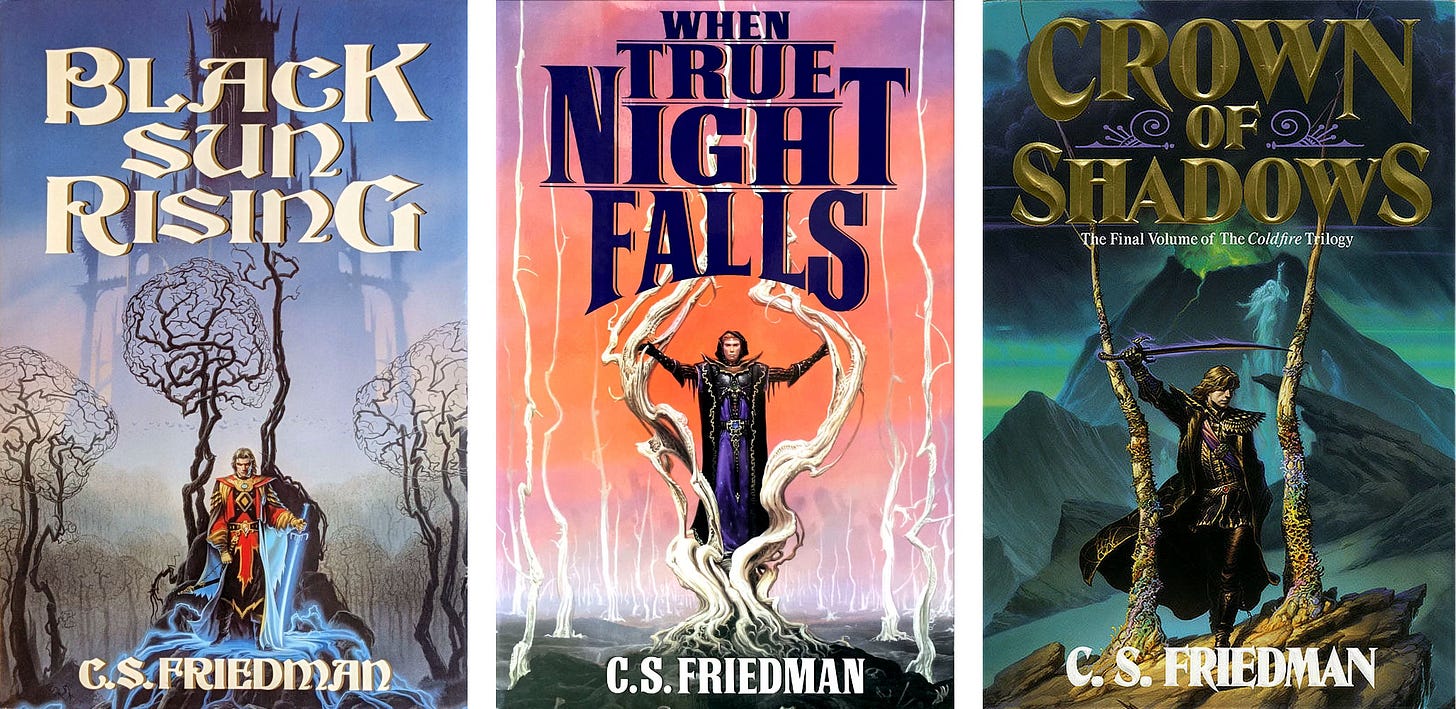

Love the insight into the behind the scenes thoughts to make these covers come together.
And that is a good stick, very discerning taste from Lola.
A few years back I asked a romance cover artist to make a fantasy portrait of my wife and I. The image was great, but it took a few iterations to get away from the book format (tall rectangle, space for a title). We ended up with a nearly square image which turned out very well.