

Second Chances, Second Lives
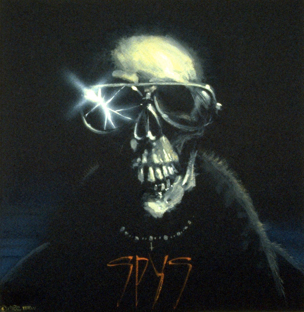
The Bloody Sun from SF illustration to rock album cover


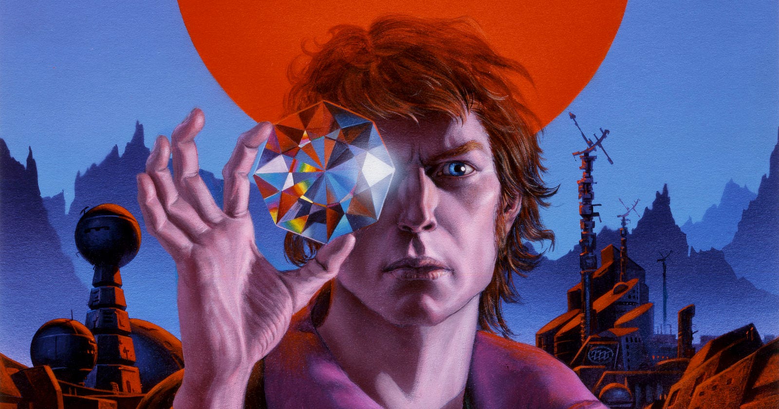
Reading through our daily art posts, fans might have an inkling that Michael Whelan holds himself to an exacting standard. In his commentary, there’s always a nitpick, some small criticism or regret voiced. It makes me wish that we could swap roles if just for a moment so he could look on his artistry with fresh eyes.
A few years back, I leaned into his critical impulse and asked if there was a book he’d like a “do-over” on. His answer genuinely surprised me. I knew nothing about The Catalyst by Charles L. Harness except it was his first symbolic use of an ammonite. Michael simply wished he could have done an excellent book more justice.
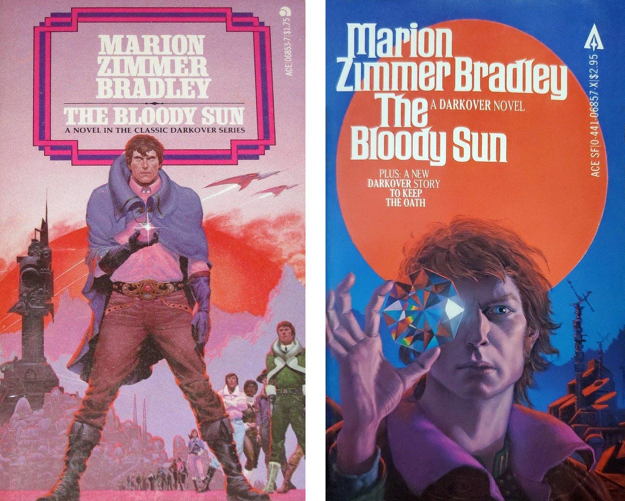
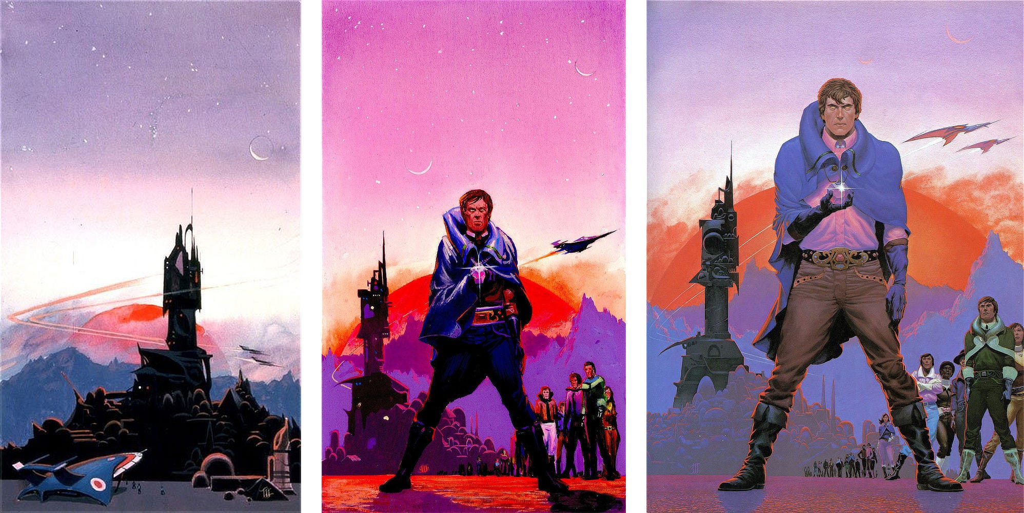
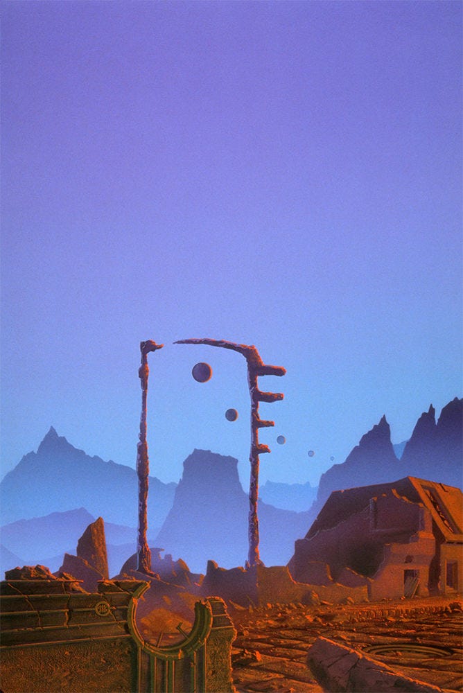
Fast forward to this week when I scheduled a post featuring The Bloody Sun by Marion Zimmer Bradley, a book he had a chance to revisit years after his original assignment. I asked Michael, thinking it might be his only do-over, and he provided a wealth of background from commission to sale of secondary rights.
Interestingly, this second chance cover took on another life as album art for Spys, a rock band that spun off from Foreigner, featuring keyboardist Al Greenwood and bassist Ed Gagliardi.
Michael Everett
P.S. For the record, Michael had multiple swings at The Gunslinger, but that’s a story for another time…
A Return to Darkover
Each of the Darkover books assigned by Ace came to me in the form of Xeroxed pages of a scene they wanted me to depict—often with important details lacking!
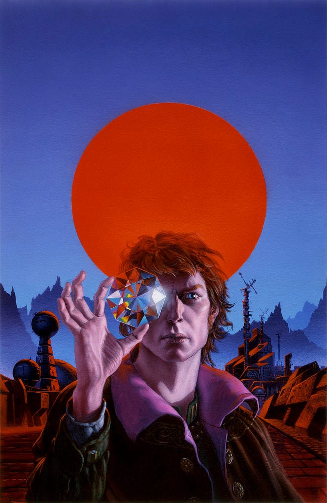
For this one, I struggled with how to approach a world lit by a red sun. What would it look like on a planet like that? Would our eyes adjust to the altered spectrum enough to see the same as under a yellow-white star? Or should I paint the cover using only reds and subdue every other color?
I remember circling around the question until finally deciding to paint the red sun as a graphic element—symbolically, a big red spot in the background—rather than trying to depict it as a natural object in the sky.
Though I was fortunate to get a second whack at the book, I still feel the painting landed short of the mark.
Being quite a bit older and more experienced now, I’d relish the challenge of painting the scene as realistically as possible, taking a Chesley Bonestell-like approach to the subject. Wouldn’t that be cool?


Another Cover, Another Life
The way it usually went down for album covers was that I’d get a call from an ad agency or record company art director, asking if I was available to drop everything and deliver a painting to them yesterday.
I’d bring them back to the reality that I was booked solid for the next eighteen months. Could they use something I’d already done? Inevitably they would ask what I had. I’d send them transparencies to choose from, and we’d be off to the races!
With secondary rights sold, I could get back to my regular work…or so I thought.


This was an entertainment business deal, which are never so simple. No sooner than I’d dusted my hands and returned to task, I received a follow up call saying what they really wanted was a wraparound cover for the album. Could I do an additional painting so they’d have all the image they’d need to make that work?
Sooo…I ended up having to squeeze in a painting overnight for the project after all.
A Trip To Jimi’s Place
The best part of the project was delivering the artwork to the band in person at the legendary Electric Lady Studios in the Village, where I marveled at the pop culture Mecca that Jimi Hendrix built. The guys were really great, interesting, welcoming and possessing impressive musical chops. I got to hear the band and listen to a few tracks for the album.
The engineering room—specifically the custom-made playback sound system in there—was phenomenal. To my unaccustomed ears, each track sounded magnificent. But that’s kind of a problem: even a mediocre track might sound wonderful in such an ideal environment, I realized later.
What a band really needed, I thought, was a cheap transistor radio to play emerging recordings on. If it sounded catchy on that, it would be ace on a state-of-the-art system.
I’ll Meet You in the Kitchen
The idea of a lo-fi approach is analogous to my own experience making art. Before I was able to deliver paintings as transparencies—and later in digital formats—I used to take art into the city and literally hand it over to an editor, art director, or publisher—sometimes all three at once.
Invariably when the painting was unveiled, I’d instantly see all the defects that weren’t apparent in my studio; I’d be aghast and struggle to hide my dismay. What’d happened to the painting that looked so perfect?!? How could I have missed that drawing error, those clashing colors, that cat whisker stuck in the paint? 🤣
That’s why for many years Audrey would remind me—pre-delivery!—to subject presumably finished work to what we called “The Kitchen Test.” If the painting looked good in the kitchen, it would look fine in the art director’s office.
This has always proven to be true! You see, in the idealized lighting of my studio as it often turned out, I would focus on one thing or another without really seeing the picture as a whole. This usually happened because I was in effect retracing problems that had already been worked out in comps or sketches.
No matter how I experimented with different lighting scenarios [office fluorescents, daylight, tungsten, LED bulbs, etc.], my artwork always looked different when shown for the first time…whether in a gallery or in an office.
There’s a reason I reach for a glass of wine at art openings!
Alas, since the business went digital with artwork submitted via the internet or thumb drive, The Kitchen Test has been somewhat forgotten…and I regret it. There are a few works done since 2010 that could have benefitted from that ritual.
From now on, that’s why I’m sticking to tradition…I’ll meet you in the kitchen!
Michael Whelan
Weekly Art Recap


Tarrant’s Realm - debut cover for the brilliant Coldfire Trilogy by C.S. Friedman
Memories of a Distant Sea - painted for my second Tree’s Place exhibition
Mordred - interior illustration for The Dark Tower by Stephen King
The Red Step - painted as a way out of depression and artistic block
Time and Again - an early Ace commission for Grand Master Clifford D. Simak
The Mist Beyond - inspired by Frank Muller’s narration of Stephen King’s classic
Original Art At Auction
Another Whelan original from the Barry Lamka collection is listed at Heritage Auctions. Online bidding concludes Wednesday, May 27, followed by a live auction.
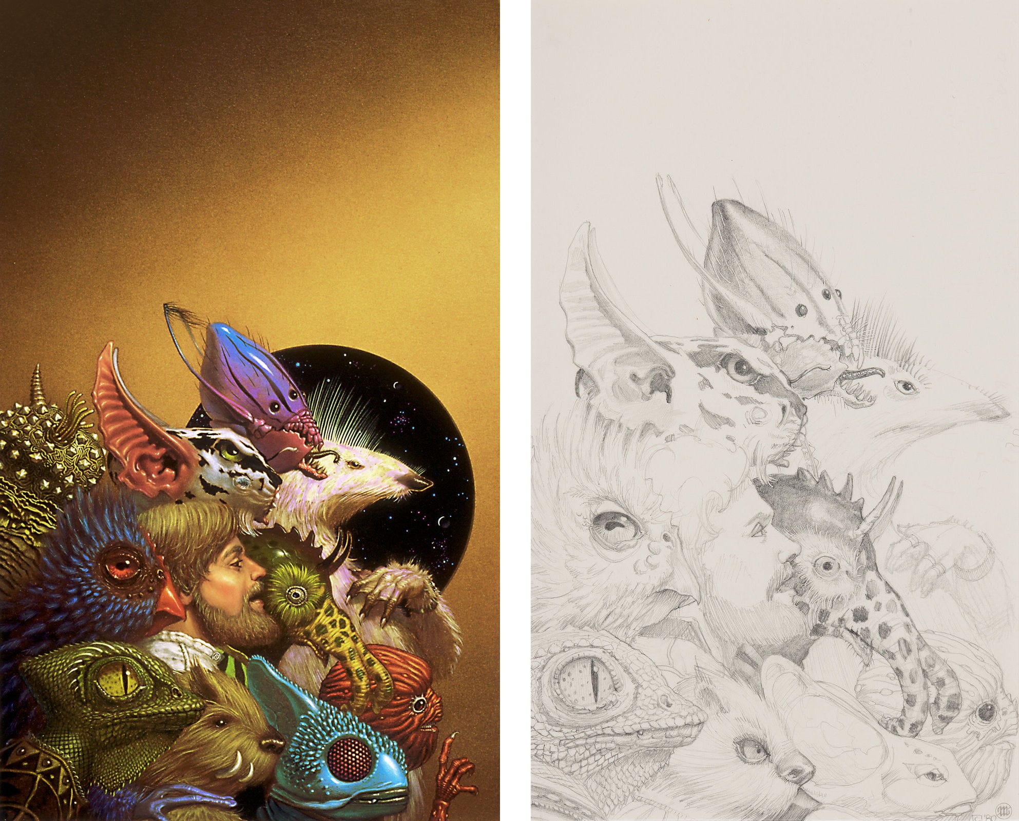
The piece is a detailed pencil study for the Aliens! anthology, a fan favorite edited by Jack Dann and Gardner Dozois published by Pocket Books. It’s a fine example of Michael’s lighter side and a rare opportunity to witness his draftmanship, especially from that earlier period of his career.
For those curious, the original cover painting is still in the Whelan collection and open for inquiries.
Like what you see? Subscribe!
We’re posting art every day on Substack. Don’t want to miss anything? Subscribe to get a weekly email including a recap of daily art posts.
To receive every art post by email, you can opt-in by visiting your account and then clicking the toggle for Daily Art.
Having worked in recording studios a fair number of times, I heartily second your idea of a cheap transistor radio (or I guess a cheap cell phone, nowadays) for test playback. Almost no one has a state of the art stereo nowadays. :(
Badass.