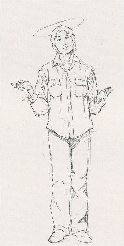
This was a difficult book to illustrate. When confronted with a plethora of ideas, themes, and opinions, the best I could do is mirror that complexity rather than to choose only one idea and compose a misleading cover.
While reading this book, I thought the cover painting should suggest antique Vatican art, so I chose a color scheme that hinted of age and heavy coats of varnish gone yellow. It occurred to me to add a "crackle" varnish coat and apply gold leaf to the halo, but I decided that both effects wouldn't have made the transition well into print.
A side note: to get the right angle and lighting on the figure's shoes, I had a friend hang from a tree by his hands while I sketched his feet. I had to draw quickly!
Additional images from JOB: A COMEDY OF JUSTICE


Share your thoughts…
We’d love to hear your feedback. Please let us know your thoughts, questions, etc!
Like what you see? Subscribe!
We’re posting art every day on Substack. Don’t want to miss anything? Subscribe to get a weekly email including a recap of daily art posts.
To receive every art post by email, you can opt-in by visiting your account and then clicking the toggle for Daily Art.


Another favorite of mine, both book and cover!! ❤️
Still one of my favorite covers.