
As February quickly comes to a close—and a chilly one at that—we’re working through a backlog of questions from social media, email, and of course here on Substack.
For this second round of questions and answers, Michael shares his thoughts on the incredible James Bama and provides insight into his own process and technique.
Thanks so much for all the fantastic questions and comments…keep ‘em coming!
Michael Everett
Ron B asked via email:
I’m curious if Michael would be willing to discuss any other SF/Fantasy artists that were/are influential on him? Having one artist geek out about another artist is always fascinating to me.
If I had to name my two favorite illustrators, I’d pick Michael Whelan and James Bama. Any thoughts on [Bama’s] work?
MRW: Yes, Bama was, in a word, incredible. His painting technique was impeccable, and whenever I’m tempted to do something in oils I feel the pressure of knowing how fine his work was, and think, “well, maybe another day.”
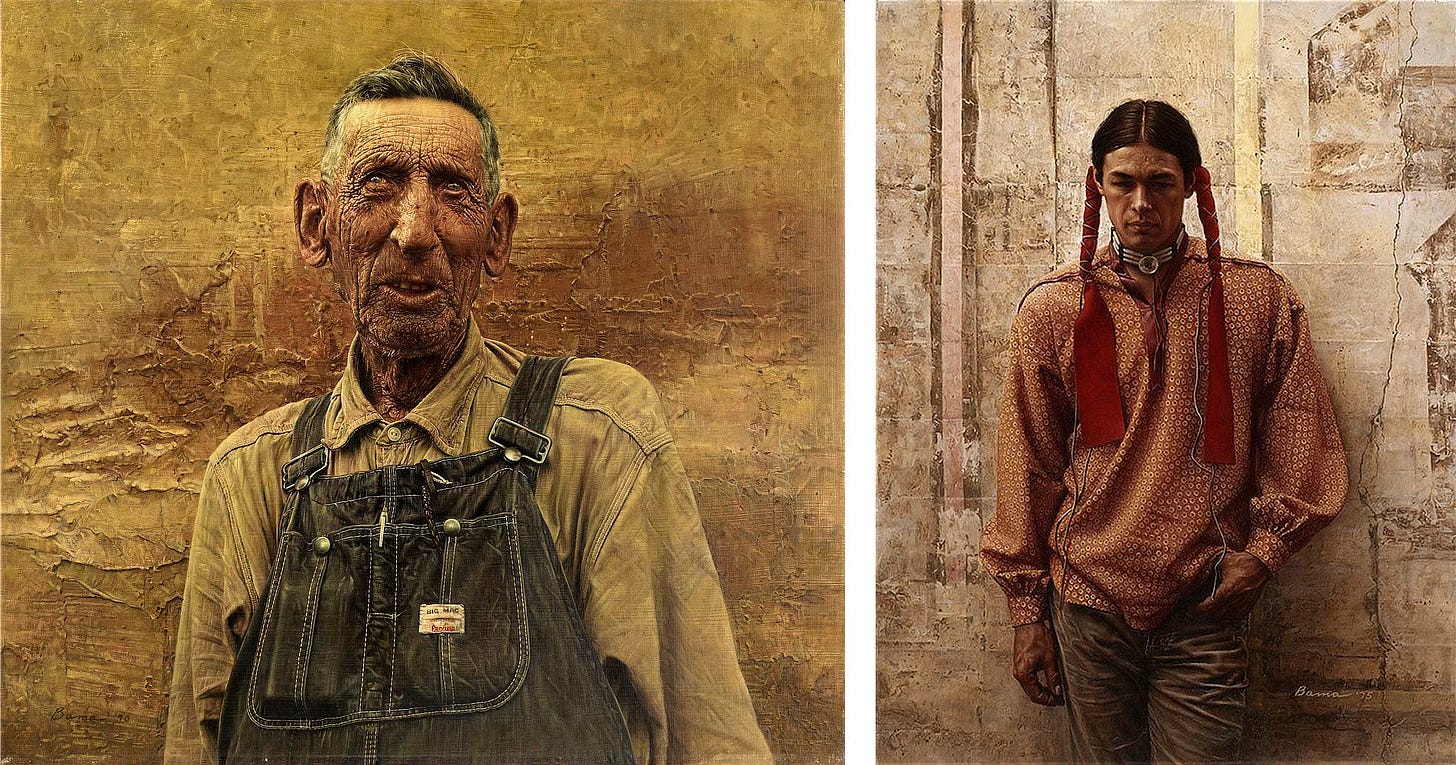
Then I remember that I’m here to paint my stuff, not Jim Bama’s–he’s already done his work and it stands as a testament to his skill forever. Meanwhile, I’ve got my own fish to fry, and do the best I can with it.
I’m especially fond of his illustration, because it seems more imaginative to me than his Western paintings. His Doc Savage paintings have influenced a host of other artists, and will always be revered for the classics they are. I hope I can see an original of his some day.
Editor’s note: I intend to circle back on the first part of the question in future newsletters as there’s a lot of ground to cover with artists who influenced Michael. Let me know if there are specific artists you’d like us to cover.

Deborah Sanders asked on Substack:
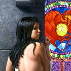
This is stunning. We can feel the sunlight through the glass. How did you get translucence and opacity in the same image?
Truly miraculous. Thank you—and, as always, we love knowing the background facts.
I believe I painted the window by using glazes of color over a white or very light priming base layer, so that the color was actually “lit” by light hitting the white layer then bouncing through the color glazed on top.
This gave the window a more realistic glow and intensity compared to the opaque painted areas. I hoped the contrast between the two approaches would underscore the differences in lighting going from the foreground to the background.

Michael wrote about THE WILDING:
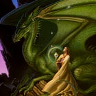
This painting represents a hybrid of techniques for me. I did the original sketch in acrylic, scanned it into the computer and adjusted it using Photoshop, then output the study full size as a monochrome print on canvas, which then became the underpainting for the final rendering.
Pierre-Yves Martin asked on Mastodon:
So beautiful but also damn interesting to understand the process…what gave you the idea to do the acrylic → photoshop → b&w printing → painting again sequence/workflow?
Yeah. Well, I liked the comp so much that I felt all I had to do was blow it up and use that reproduction as a basis for a final rendering. Scanning it and printing a full-size enlargement seemed the simplest way to get going on the final painting without having to redraw the thing all over again, which would have been both needlessly time-consuming...and boring.
While I had the monochrome image in my computer, I decided to design and position the little globular spaceship into the composition, which is where the Photoshop work came in.
I hope that clears up my attitude towards the process somewhat.

Shane Patrick White asked on BlueSky Social:
The thought of revising something is difficult enough, but to go back in years later...how did you manage to remember your color mixes? Did you do it on the original and patch it in separately?
No, I just painted on the original. I changed some of the colors, but I just matched what I needed to and went with what looked right. I don’t know how to explain it better.
To be honest, I don’t know how I obscured all those glowing light shapes off the first version. I think I just painted over them and matched the colors underneath to hide the alteration.
Weekly Art Recap


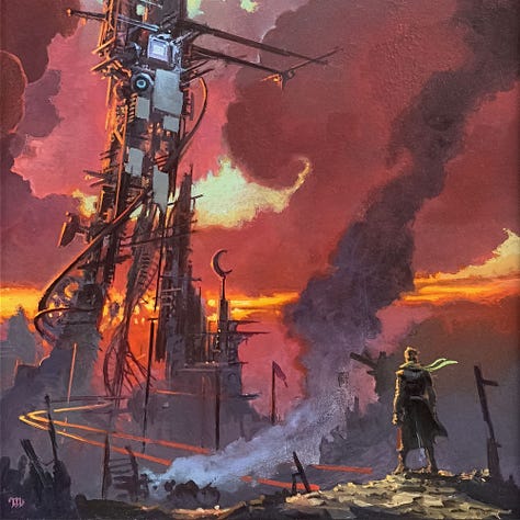
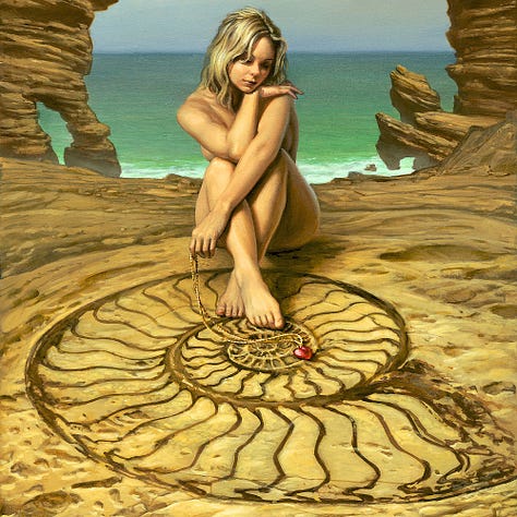


The Crimson King - interior illustration for The Dark Tower by Stephen King
Glimpse - first use of the red glass heart as a symbol
The Furnace Lands - 2nd L&PG for 2025 inspired by Black House by Stephen King
Equanimity - musing on a cherish virtue, evenness of mind and composure
Daughter of Regals - fan favorite cover for Stephen R. Donaldson
The Rider - cover for two Grand Masters, Frederik Pohl and Jack Williamson
Subscribe so you don’t miss a thing…
If you like in-depth content about Michael Whelan’s art, please consider subscribing. Our weekly newsletters are free, and we offer additional perks like original art previews for paid supporters.


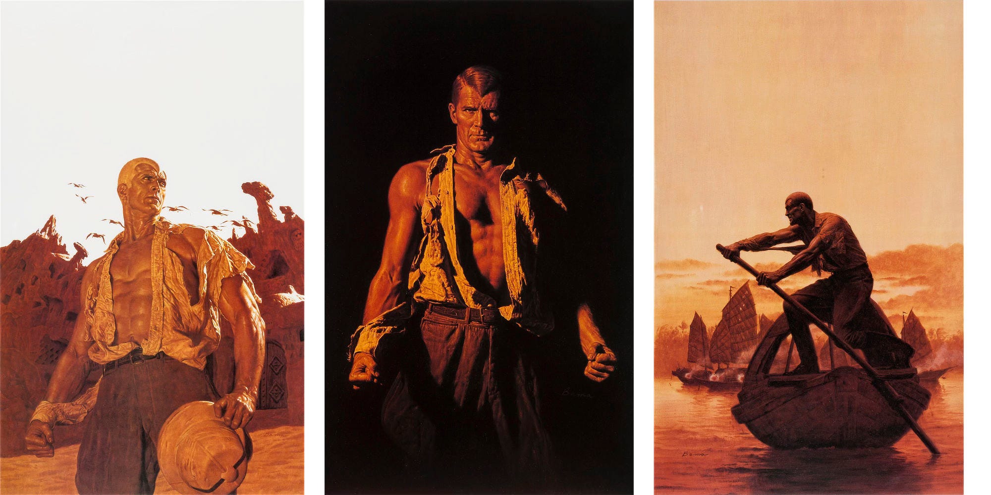

Open invitation for Michael, should he ever find himself in Los Angeles, to get an in-person look at my Bama painting done for Doc Savage The Mental Wizard. Brings me joy every time I look at it.
Thanks Michael. I have long been a fan of James Bama and have two books of his artwork. His skills leave me in awe, and I especially enjoy the power he conveys in his treatment of Doc Savage. I would love to see your commentary on the original Doc Savage artist: Walter M. Baumhofer. His work’s are so inspiring in the use of color and economy of brush strokes. He was a master in the Golden Age of illustration, particularly Pulp book covers. Sam Taylor