The following text written by Gerald W. Page served as introduction to the horror chapter of Wonderworks. Page was Michael’s editor on The Year’s Best Horror Stories early in the series from 1976-1979.
Horror
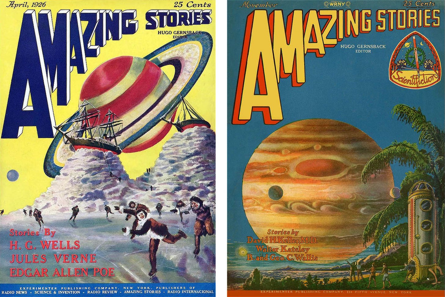
One of the major problems in publishing fantasy has been illustration, particularly cover illustration. When the science fiction magazines came along, artists like Frank R. Paul were able to find elements to include in their paintings and drawings that exactly pinpointed what SF was all about: Paul’s painting for the first issue of Amazing might be one of the most crudely painted covers he ever did, but it could not be mistaken for anything but science fiction with that gigantic image of Saturn right above the heads of those ice skaters. It was the work Paul did for the first issues of Amazing that set the pace for the style.
Fantasy presented greater problems. You can identify a scene as science fiction by featuring a spaceship, for example, but the elements that make a story fantasy are more subtle. Horror is a phase of fantasy that seems to present the artist with even greater problems than other types.
For starters, it’s just as hard to isolate an identifiable element for the cover of a book of horror stories as it is for any book of straight fantasies. But other problems enter in. Problem one is taste. It's very easy for the element of horror to give way to one of sadism, an element that usually has very little to do with horror.

The second problem is originality. When I want an illustration for a good vampire story, nothing makes me angrier than to have an artist give me a drawing of Bela Lugosi. Movie monsters belong in the movies. Artists who base their concepts of horror illustration on movies aren’t using their imaginations.
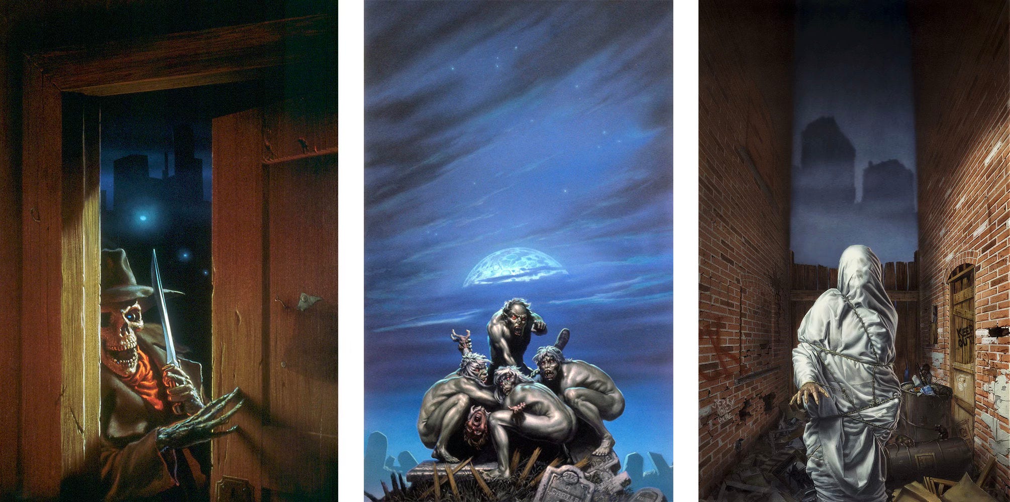
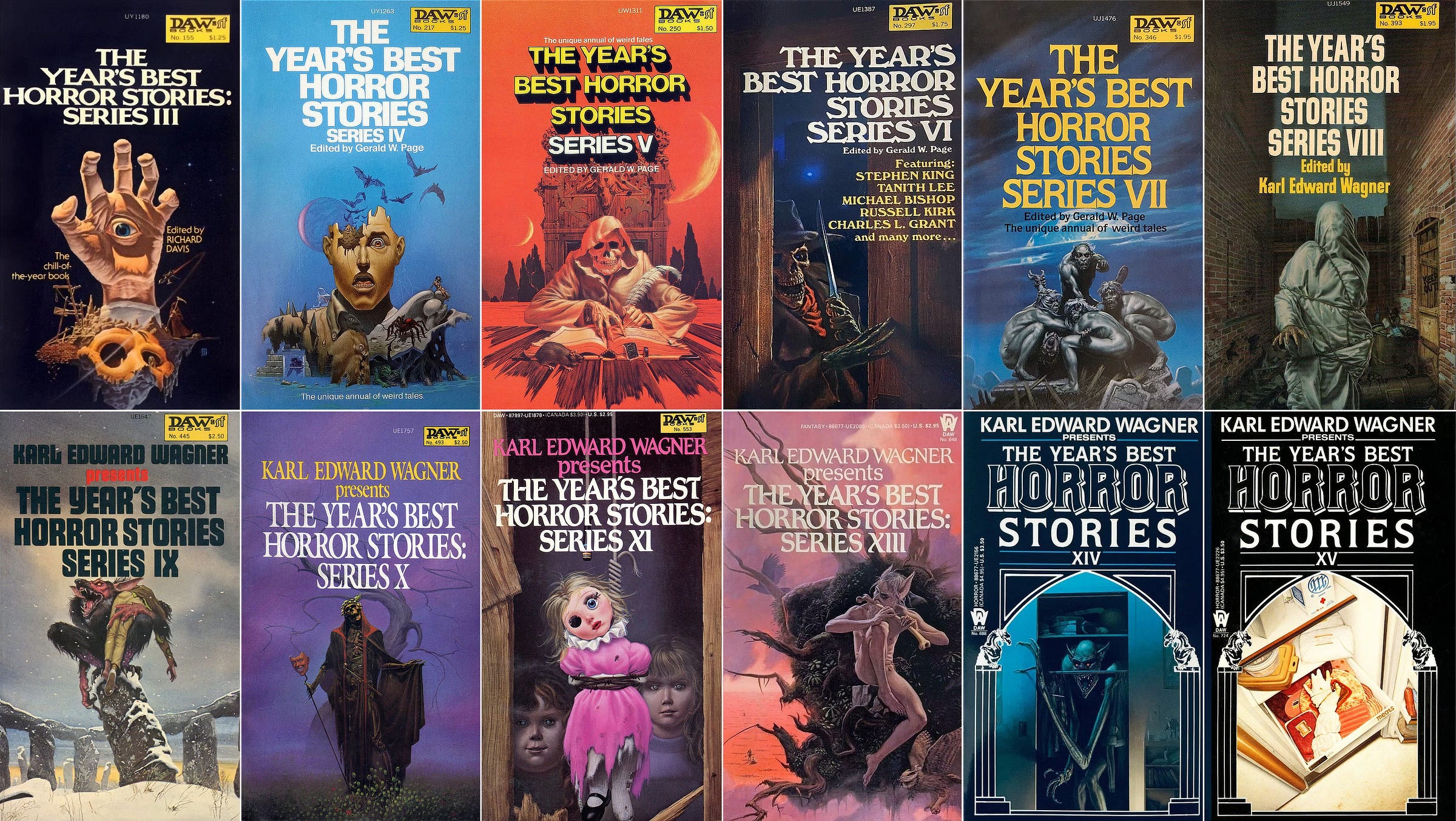
An artist who does use his imagination is Michael Whelan. The first three volumes in DAW Books’ series The Year’s Best Horror Stories were edited by Richard Davis. I started with number four. It was the first effort of mine to have a Whelan illustration. He gave us a nice serene blue cover with an almost surrealistic gathering of traditional horror elements such as the spider, that demon in the window, a lizard monster, bats—lots of bats—and something wormy thawing out nicely on that fellow’s shoulder. Traditional elements, yes, but hardly a traditional arrangement.

For Series V, Michael Whelan went from peaceful blue to a bright and almost cheerful orange. And appropriate it is, because what looks more cheerful than the inescapable grin of a skull? Especially as demonstrated here by one of Michael's favorite models. Whelan's incredible eye for detail is shown once again, in such touches as the bracelet on our subject‘s wrist, and the bookmark protruding from the pages of his journal. And don't overlook the intricate design on the back of that chair.
The trick in doing a series—writing one, editing it, or doing the illustrations—is to come up with something each outing that's better than what you did previously. It’s not easy. Year after year, few people can manage it.

Whelan always seems to come up with something for The Year’s Best Horror Stories that tops what’s gone before. Once again, his relish for this type of work is very evident, as is the relish of the subject for whatever work it is he’s about. In fact, this is a first-rate character painting—though I wouldn‘t want to meet this character—especially in isolated circumstances!
Again, note the detailing, but pay special attention to the professionalism with which that detailing is displayed. This is a very simple, direct painting, and the details were carefully selected for effect, and used sparingly so that they don’t overwhelm the painting. Good taste, you see, applies not only to subject, but also to every facet of a painting, and how these facets are presented.
Since I became the editor of The Year’s Best Horror Stories series. I’ve been very lucky in having covers by Michael Whelan. His work has been eye-catching, product-identifying, tasteful, and original. His highly developed technique, his color sense, and especially his attention to detail conjure a spell that must have accounted for a lot of bookstand sales.
-Gerald W. Page
Beyond the Numbers
In total Michael illustrated 12 covers for The Year’s Best Horror Stories anthologies, and these paintings represent a meaningful arc in his career. Between 1975 and 1987, he missed only one book, making this his most regular assignment as an illustrator.
Curious, I asked what happened in 1984 and apparently it came down to a conflict in schedules. This was the same year he went to Los Angeles to paint the cover for the Jacksons’ Victory album, so that would be my guess as to which project took priority
Context is crucial to understand his long attachment to the series. Every year he looked forward to the assignment because it was a break from the science fiction and fantasy that dominated his calendar. Being able to shift to the darker side of his imagination helped keep him fresh creatively.
Anthologies came with a kind of creative freedom that felt different. He could pursue ideas uniquely his own when working without the constraint of a manuscript. As the years progressed, I believe those creative opportunities prompted an evolution in Michael’s work that would ultimately lead to artistic pursuits beyond illustration.

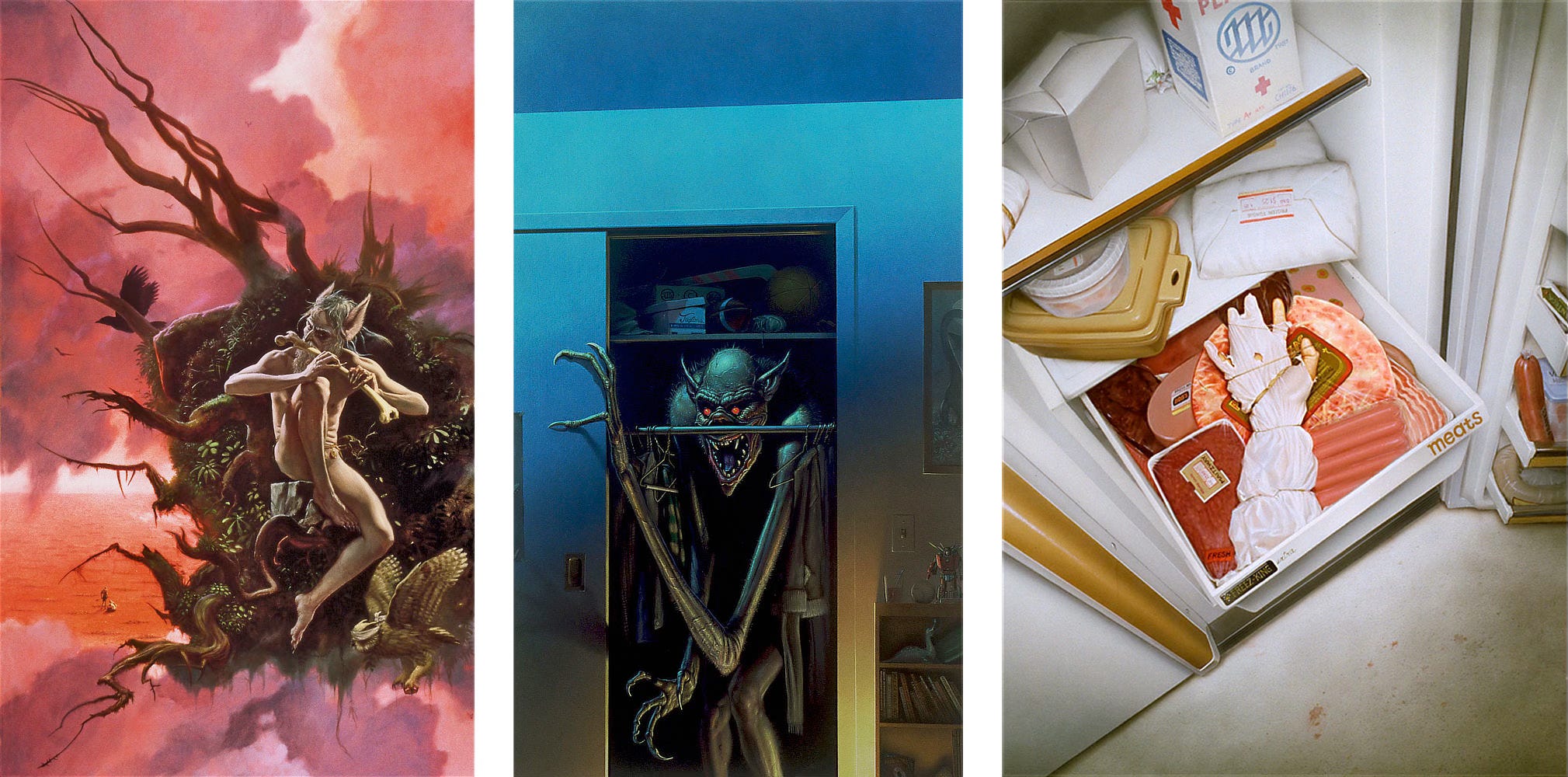
In DESTROYING ANGEL, we see Michael’s facility with symbolism in full bloom. From purple haze to the field of poppies, each element is a master stroke that builds on the next. Notice the subtlety he took in costuming the angel of death with pipe tucked into belt, spoon and syringe dangling from cords, and crown of Destroying Angel mushrooms to represent a state of living death. Michael’s embrace of abstraction in the trees branching like blood vessels brings it all together concisely.
Then we see Michael’s consciousness bubble up in TWO WORLDS. The painting was inspired by a magazine photo of a desert filled with burial mounds, the tragic result of famines in Ethiopia. Michael channels the horrors of the real world to make a statement about our comfortable position in the West. When confronted with conditions in the Third World, so many of us feel powerless to affect change—or worse remain apathetic towards the suffering of our fellow humans. This was a painting he wanted to do that fit the assignment for a horror cover.
There’s a maturation of thought here that feels like a precursor to his gallery work. It’s no accident that he seized on the freedom of assignments like these to exercise creative muscles that would serve him later in the leap to fine art.
Weekly Art Recap


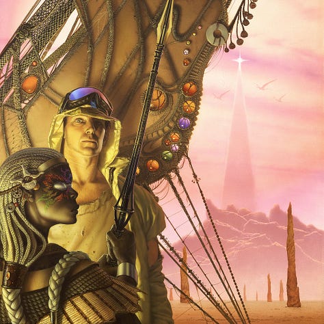
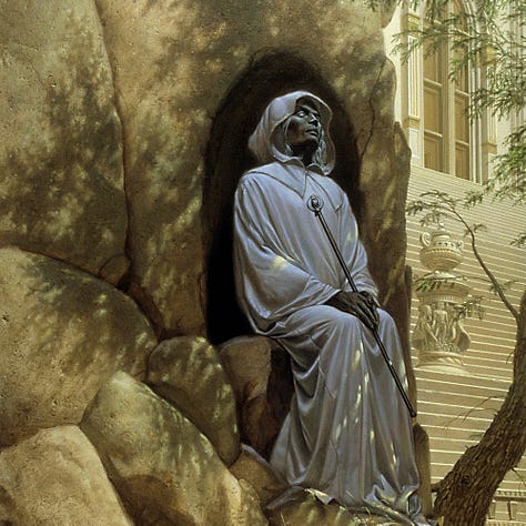

Descent - cover for the Ray Bradbury classic The Martian Chronicles
Apotheosis of War - a timeless exploration of the horrors of war
Empire’s Horizon - cover illustration for John Brizzolara
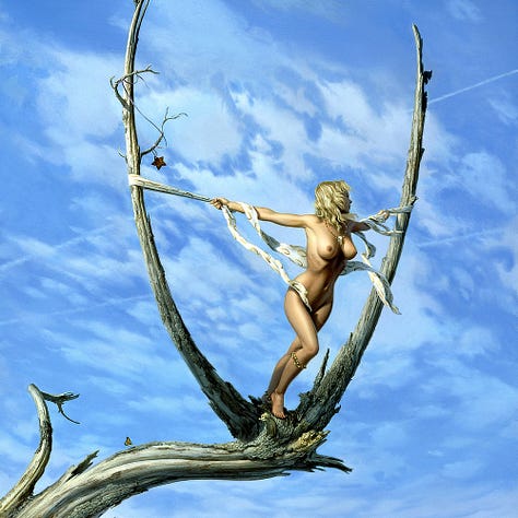
The End of Nature V - a personal visions that requires looking beyond the obvious
Narrow Way - cover illustration for Death’s Master by Tanith Lee
Neither a Boy Nor a Boy-Sized Spider - a nonconventional take on Mordred from The Dark Tower by Stephen King
Coming Soon…Leftovers & Palette Gremlins
We have another small painting in the L&PG series coming on Wednesday (10/16) at 11am EST. This will be the fourth in the 2024 gallery.
As always, there will be a special preview for paid subscribers leading up to that.


Great article about you Michael. It was always fun working with you.
Loved all the covers but seeing Series IX with the Snowfall art is a little bittersweet. I had bid on and won the corresponding sketch at Balticon several years ago but when I went to get it the people running the art show said they had made an error and had already handed it off to someone that said they were there to collect it. Still not sure how that worked without proper badge ID and all.