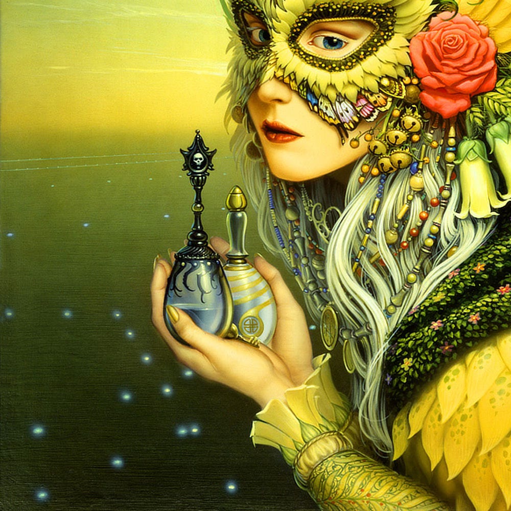
I was glad to learn that Joan Vinge was writing a sequel to The Snow Queen, and even more so when I got a call from Warner Books for the cover assignment. From the moment I finished the manuscript, I knew how the cover art had to look...a mirror of the first with some obvious differences.
As in the painting for The Snow Queen, the mask becomes the framing structure for symbols of various ideas and elements in the novel. The central figure is seen holding vials representing the "water of life" and the "water of death."
In the background is a spaceport in sunset, with the converging lines on the tarmac pointing to a new horizon. The middle of the sun disk in the center of the woman's mask is a slightly altered biohazard/mutagen symbol, an important reference to the plot.
Whatever the specific elements of the composition, I was very concerned that the color scheme have a dark, yet golden and summery quality to it. The little sketches represent my initial attempts at finding the right combination of colors to fit the mood I wanted.

Share your thoughts…
We’d love to hear your feedback. Please let us know your thoughts, questions, etc!
Like what you see? Subscribe!
We’re posting art every day on Substack. Don’t want to miss anything? Subscribe to get a weekly email including a recap of daily art posts.
To receive every art post by email, you can opt-in by visiting your account and then clicking the toggle for Daily Art.


