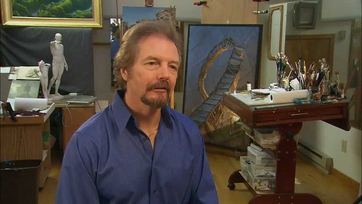
Sometimes I stumble across a sparkling little gem of content that not many fans have seen. In this case, Michael had an in-studio interview with Ed Wierzbicki for Spotlight on the Arts (Connecticut Public Television) that is well worth your time.
The video is 12 years old but provides an excellent view into different parts of the studio. The larger space is his oil studio where he primarily works on his gallery art. You can see LUMEN 9 behind him. His drafting table is in his illustration space where everything is close at hand. Lastly, we get a peek into his reading area where he works through manuscripts, making notes and sketches. ~ME
Transcript:
[Music]
EW: Somewhere past the ancient sentinels through particles of the Galactic Empire and beyond the vista at the End of Nature, there lies his world…and the universal question to each artistic challenge.
MRW: How do you distill 1,200 pages of battle scenes, characters, other worlds, fantasy landscapes, creatures, weather patterns into one image?
EW: Creator of over 350 book and magazine covers, illustrator and painter Michael Whelan is master of the sci-fi and fantasy domain, and he begins the creative process here translating it in all author's words into a visual world.
[Music]
MRW: Most of the time it's buried there and it requires a little bit of confluence of different ideas and themes to come together with an image that's going to represent the whole manuscript.
Sometimes it'll happen on the first read through. I'll finish the book and I'll have an image in my head of what the cover has to look like and it's like a message from heaven or something…that this must be the book cover.
That happened to me when I read Robert Heinlein's book Friday for example, and indeed when I did the painting and the book was published, Heinlein called me up and said, “That's her!”
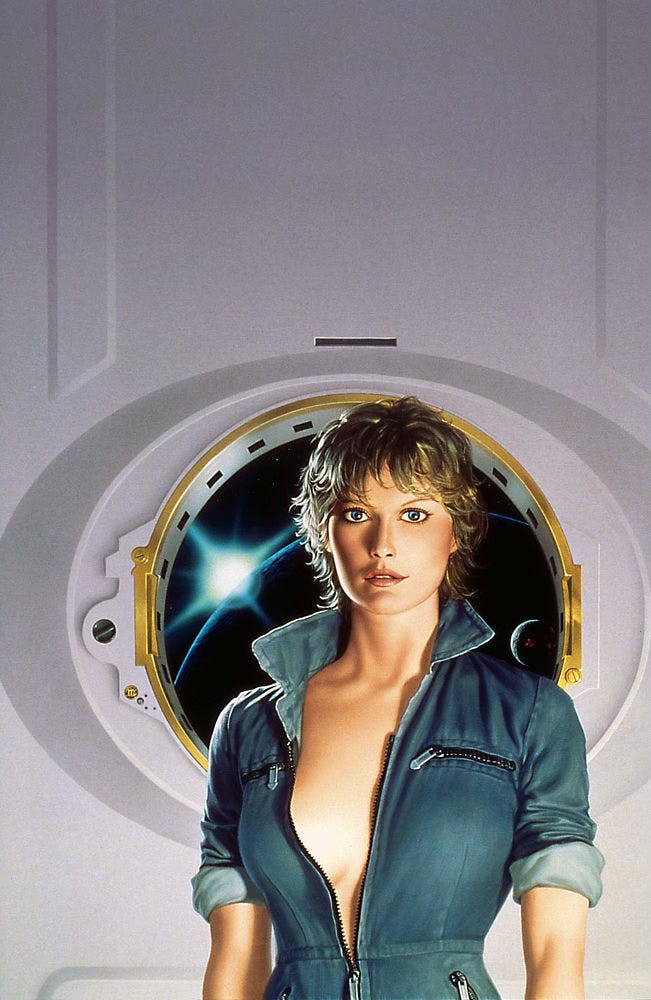
EW: A child of the 1950s, Whelan was captivated at a young age by America's mission to reach the final frontier.
MRW: Well, I was born into it. My father worked in the aerospace industry. He was a company rep for Lockheed, so we often live near missile bases. And so I saw a lot of rocket launches. There's nothing like waking up at three in the morning and looking out your bedroom window and seeing a Titan 3C go up in the middle of the night.
EW: And soon sci-fi films and stories awakened his creative potential.
MRW: I'd see a science fiction movie when I was very young and come home and try to draw scenes from the movie. It just seemed to naturally progress from visual things to what I was reading. If I didn't have a movie to draw from then I had to make it all up from what I saw when I was reading the words. That was even more of a challenge and I enjoyed that even more
EW: The sci-fi paperback pretty much evolved from the popular pulp fiction of the 1930s and 40s and that picture on the cover…well, it always got you started. That sexy noir image of the femme fatale or woman in distress soon became a scantily clad female surrounded by heroic men in space suits. But gradually through the work of artists like Michael Whelan, sci-fi cover art grew much more sophisticated.
MRW: The cover I did for Foundation has these long vertical towers in them and they have a an odd shape. I made them look long and tall with a kind of mushroom shape on the top. They look like the photograph of the bomb over Nagasaki.
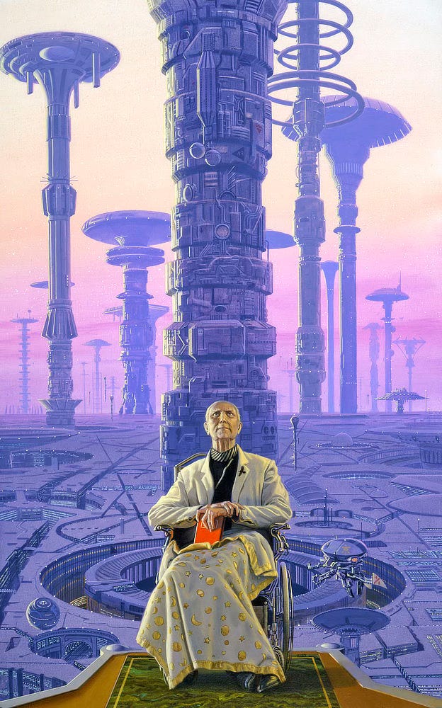
MRW: So I do all my work up here on the second floor.
EW: Fast forward to the 21st century in Whelan's artistic journey has resulted in scores of industry achievements but the real reward is about earning the trust of legendary writers like Stephen King and Isaac Asimov.
MRW: There's a challenge and yet a sense of freedom and that’s where a subjective inner sense of a particular artist comes into play because you respond subjectively to what you're reading and try to come up with imagery that's in harmony with what the author is intending.
EW: Whether he goes face-to-face to model a gesture or messes with metaphor to frame his own life, Michael Whelan is allowed permission to completely escape at least long enough to shape a few hundred pages into an imaginary yet highly believable reality.
For Spotlight on the Arts, I'm Ed Wierzbicki.
[End transcript]
Weekly Art Recap
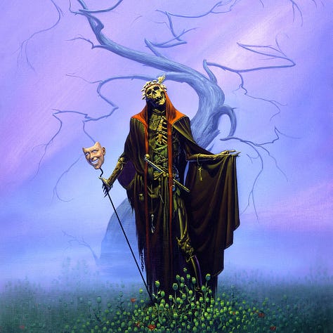
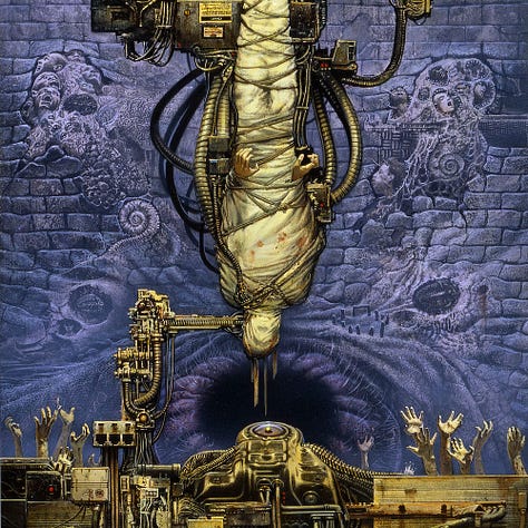
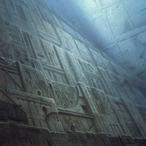
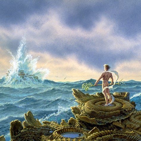
Meatloaf Ascendant - album cover for the best of Meatloaf
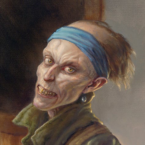
The Ghoul with a Pearl Earring - a play on the classic painting by Vermeer
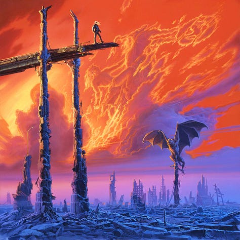
Destroying Angel - cover for The Year’s Best Horror Stories
Cacophony - album cover for Chaos A.D. by Sepultura
Subterraneans - a Faded Star painting closely linked to The Red Step and Climber
Fortitude - the classic virtue as inspired by Edgar Rice Burroughs’ John Carter
Share your thoughts…
We’d love to hear your feedback. Please let us know your thoughts, questions, etc!
Get Out and Vote Tuesday!
It has been a looooong election cycle here in the U.S. While I can’t deliver on promises of “hope” electorally, I will provide visuals!
If you haven’t already voted, make sure to do your part and turn out on Tuesday. Make a plan…and take a friend! It’s important to exercise your franchise. You’ll feel much better when you do.
Original Art on Wednesday November 6 at 11am EST
Usually the 1st Wednesday of the month we have a new entry in the Leftovers & Palette Gremlins gallery, but we’re shifting gears with the holiday season fast approaching.
We will have a small selection of art (remarques and possibly more) to honor a certain author’s social media tease of a return to Mid-World. Paid subscribers should expect an exclusive preview in their inboxes a day or two before the drop.
Like what you see? Subscribe!
We’re posting art every day on Substack. Don’t want to miss anything? Subscribe to get a weekly email including a recap of daily art posts.
To receive every art post by email, you can opt-in by visiting your account and then clicking the toggle for Daily Art.




Thank you for posting the actual video! The transcript was great but watching and listening to the video is a much different and far better experience!