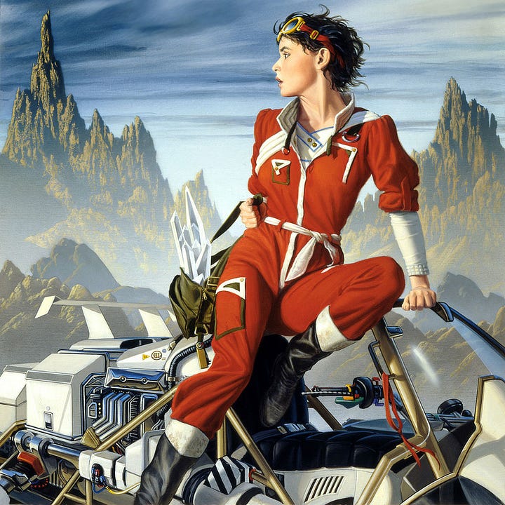
When a book has a character as interesting and well delineated as Killashandra, the best cover approach is simply to render an accurate portrait of her. If the painting works, the force of the character's personality alone confronting the viewer should be sufficient to draw the attention of the casual observer to the book.
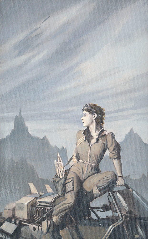
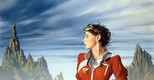
In this instance, I had just finished a painting of similar approach WITH A TANGLED SKEIN, a very direct front-and-center composition. To avoid the feeling of duplication, I turned Killashandra's attention away from the viewer toward the impending storm threatening on the left.
This change turned the illustration into a narrative one, added the symbolism of the storm, and heightened the tension and interest in the painting. The result is a whole lot better than my first sketches for this book.
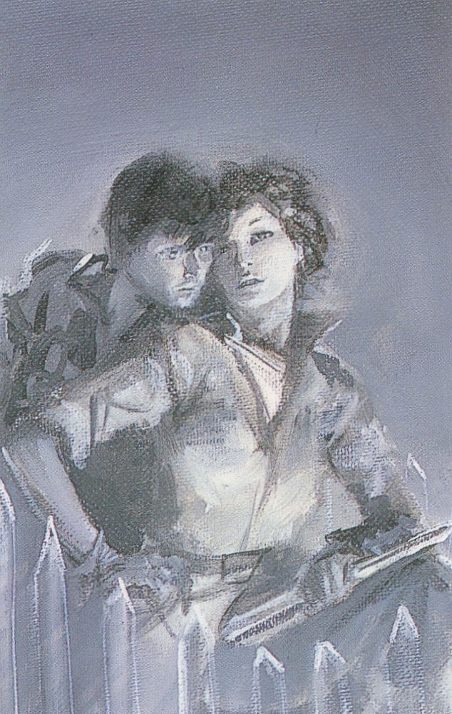
Additional images from KILLASHANDRA


Share your thoughts…
We’d love to hear your feedback. Please let us know your thoughts, questions, etc!
Like what you see? Subscribe!
We’re posting art every day on Substack. Don’t want to miss anything? Subscribe to get a weekly email including a recap of daily art posts.
To receive every art post by email, you can opt-in by visiting your account and then clicking the toggle for Daily Art.


