

Into Shayol Ghul: The Making of A Memory of Light
Plus Wheel of Time original art coming soon!


I met Robert Jordan in 2005, early on The Knife of Dreams tour when he signed at my store in Santa Cruz. One of the great pleasures of my bookselling career was the lovely chat my staff and I had with him and his wife Harriet McDougal before the event. They were truly a remarkable and charming couple.
Tragically Robert Jordan died in 2007 after struggling with a rare blood disease. Fans feared his work would go unfinished, but McDougal—his longtime editor—enlisted author Brandon Sanderson to complete The Wheel of Time based on notes left by Jordan.
Darrell Sweet, of course, provided art for the epic series until the very last book. When he passed away in 2011, the publisher commissioned Michael Whelan to illustrate the cover for the final book, A Memory of Light.
Upon seeing the finished painting, Harriet McDougal remarked: “That is the Rand I have waited to see for twenty years.”
Today, I’m so pleased to expand on Michael’s story of how that cover came to be.
Michael Everett

Visualizing the Dragon Reborn
My approach to A Memory of Light was dictated by unfamiliarity with the series. Not having read The Wheel of Time, I focused on the scene provided and the characters therein while also keeping in mind that this book was the culmination of many years of reading for devoted fans.
It seemed best to start with the focus of the painting: Rand himself.

My initial sketches explored the pose he might adopt as he entered the dark confines of the cave. I attached light sticks to a wooden bokken and descended a flight of stairs with the lights off, trying to get a feel for how he would be holding the sword to light his way into darkness. (Since early in my career, I’ve found a kinesthetic sense of the figure’s pose is helpful before attempting to recreate it in its variations.)
With an idea of the drama and abstract design qualities I felt had to be part of the picture, I went back to my drawing board and sketched out poses that might work. These started as scribbles on waste paper, which soon transitioned to line drawings on a short stack of Yupo paper I had.

Variations were either sprayed with fixative and painted on (so I could better evaluate their fitness for the task) or scanned into a digital file, printed, and painted over on watercolor paper with the line drawing underneath as my guide.
After I had a set of poses that offered possibilities, I set about visualizing the cave entrance, both from the inside and without. For these I primarily used pages from a 9″ x 12″ pad of Fredrix canvas, which I find handy for quick studies.

The interior scenes were interesting but I was especially taken with the idea of showing the cave entrance from the outside. The fracturing in the rock surrounding the cave, I felt, could work as a suggestive metaphor for the tentacles of dark power emanating from the evil forces within.
I kept painting compositional approaches—from inside the cave and outside it. Soon they littered the floor of my workplace. It was hard to step anywhere without treading on one. Of course, having all these alternatives didn’t make my choices any easier!

I re-read the manuscript to reacquaint myself with the feeling and drama of the scene described.
I questioned whether to include all the characters in the scene or only the two women who actually descended into the cave with Rand. Portraying all the characters outside at the mouth of the cave would clutter up the composition too much; the background itself was already too busy to read well.

I abandoned the approach outside of the cave in favor of scenes from within the cave, featuring Rand and his two female companions following behind.
My attention then was devoted to featuring Rand front and center on the cover. Having examined all of the previous covers for The Wheel of Time, I was aware that there hadn’t yet been a close-in portrayal of Rand. I felt it might be a welcome change of pace for the readers, especially in this final volume of the series, to have him thus singled out for attention, so I decided to try to make that happen.

I digitized all the existing cave and figure visualizations I had accumulated. In Photoshop, I played around with combining them in ways that might work. On my studio laptop, I set up a slideshow of the more appealing approaches and painted the figures selected into the backgrounds I had chosen. These I sent to Irene Gallo at TOR books for selection as a cover approach.
Some were more highly developed than others—I learned long ago that the powers that choose such things tend to favor more finished concepts than looser ones—so naturally I tended to favor the concepts I was most interested in developing into a full scale painting.
TOR selected an approach that was essentially the same as what ended up on the cover, only the version I had shown them was much looser (of course) and painted in monochrome (browns and blacks), not in full color.

I saved pinning down the color scheme until just before beginning the painting. My usual practice is to paint many small abstract color treatments. Each color sketch here was 3″ x 4.75″, and I did eight of them in all.
Deciding between the different options was extremely difficult as they all looked viable to me. In frustration, I seriously considered pinning them to the wall and throwing a dart. But instead I brought them to Audrey, and as usual she helped me make up my mind.
While talking with her, I recalled how much I enjoyed the blue background in my cover painting for A Princess of Mars many years ago. I came around to thinking I’d really enjoy revisiting that territory and voila! The color scheme evolved from the one on the lower right.

After it was decided which concept to go with, I first played around with acrylics, experimenting with making stalactite shapes using paint and a squeegee.
I was fortunately well supplied with cave photos to use as reference because I had recently gone to Carlsbad Caverns in New Mexico, where I took some pictures of some pretty strange stuff.

After that, I felt ready to start the background work. Usually I work from background to foreground, but this time I decided to work the middle area first, then do the figure of Rand and the background/sky area at the same time.
Here’s a few shots of the painting as it progressed. The background color of the panel was a light grey tone. The acetate covering the center was left in place to mask out the sky area and keep it clean until I was ready to work on it.

I wasn’t happy with my visualizations of the figures, especially Rand, so I tried using myself as a model, without much success.
I was also feeling frustrated about the coat I wanted to have Rand wearing in the picture. Sure, I could have faked it if the figure was small in the picture, but with Rand being so “up close and personal” as it were, I thought I should take the time to get it right.

I'm not sure how this painting would have come out had it not been for the generous aid of Dan dos Santos, who graciously took the time to help me find a model and the coat I was looking for.
When I mentioned my difficulty visualizing the coat Rand was supposed to be wearing, Dan told me he happened to be using one that might fill the bill. He took some photos of the coat he had, even posing with it for me.

I still felt unsure, though—having recently seen Kate & Leopold, a movie that featured Hugh Jackman wearing splendid costumes. The wardrobe in the film seemed closer to what I was looking for.
Dan introduced me to famed illustrator Edward Vebell, which was a humbling experience. Ed has had a stellar career, a real pro’s pro—and when we visited there were stacks of his paintings all over the place, amazing stuff from the 1940’s onward.

The thing is Ed also happens to own an amazing costume collection, which he rents out to other artists, photographers, theatre productions, etc.
Dan and I almost got lost in his attic looking through the hundreds of coats and military uniforms. We found a couple of likely candidates, and the next day a model came to my studio, and Dan shared photo and lighting tips with me so I could try out his equipment setup.

It was great; almost too good, actually. I felt a little like a guy wearing several watches and never knowing what the real time is. There were so many good reference photos to work with that it was hard to cull out one or two to work from and leave the rest.
The main thing I look for in posing a model is to check the reality against my visualization of a pose, and correct any errors. Once I had the information I was looking for, things proceeded at a steady pace until the painting was complete.

Digital Wallpaper & Signed Prints
During the marketing blitz leading up to the release of A Memory of Light, TOR Books produced high resolution digital wallpaper of Michael’s brilliant cover art. Fans can still download the wallpaper for free on the Reactor website (formerly TOR.com)
For those who prefer prints, A MEMORY OF LIGHT is available in our shop. This gorgeous open edition giclée is printed in studio on the finest quality paper and hand-signed by the artist.
Mix and match with prints from The Stormlight Archive for discounts up to 20% off.
Weekly Art Recap


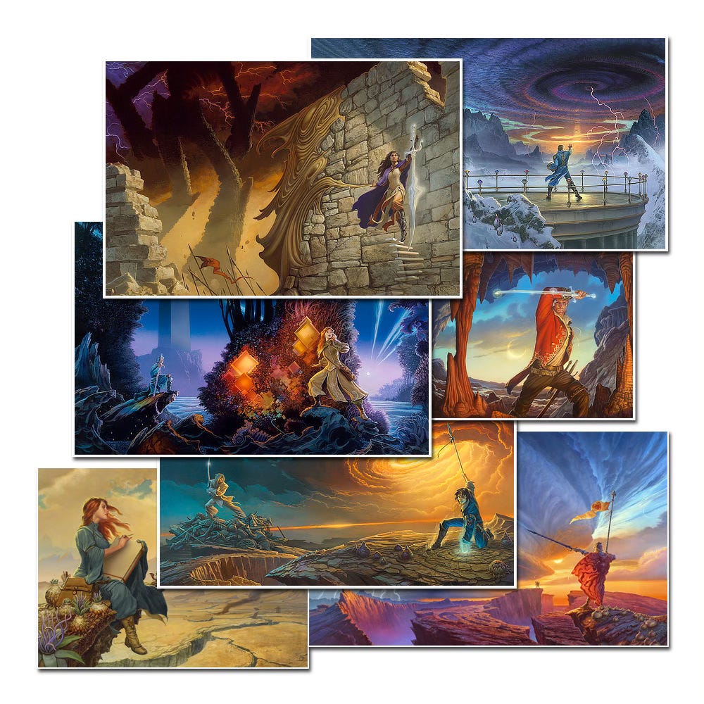
Firestarter - a Stephen King limited edition cover for Phantasia Press
Lumen 4 - the first in a series of paintings playing on various meanings of “lumen”
Honor’s Champion - figure study for Wind and Truth by Brandon Sanderson
Time and Tide - navigating obstacles in search of truth via intuitive experience
Legends of the Fallout - Mutant Hunter cover for Stephen R. Cox
Retrospection - stepping toward the future through the gateway of the past
Coming Soon…Wheel of Time Original Art!
We just sent out for framing two preliminaries of Rand al’Thor from A Memory of Light, the first of which will be available in our next Whelan Wednesday offering.
An exclusive preview of the original art will be available for our paid subscribers on Substack before the art is released in our shop on Wednesday, April 16 at 11am ET.
Subscribe so you don’t miss a thing…
If you like in-depth content about Michael Whelan’s art, please consider subscribing. Our weekly newsletters are free, and we offer additional perks for paid supporters.
I love the story behind this epic cover. Michael's cosplay as Rand is great! I wonder what was the concept for the Calandor here, the sword that is not a sword, it is in the center of the focus here and I always imagined it to be something different.
Alright, I gotta share this with the Whitecloaks now.